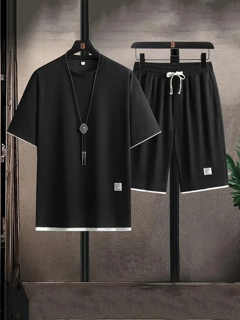
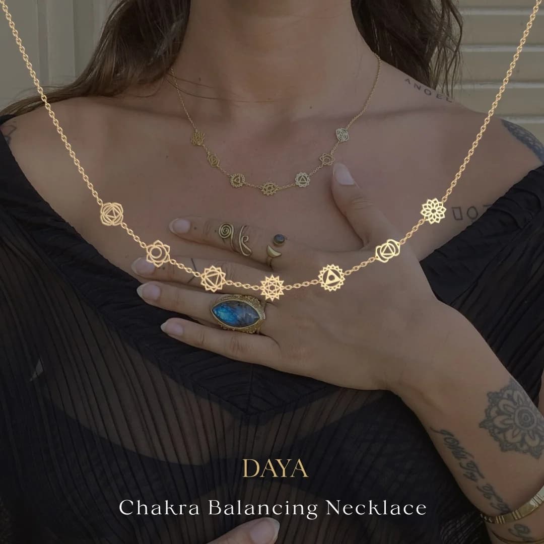
Black Casual Outfit — Minimalist Product Display — Jewelry Ad Example
This ad employs a minimalist product-on-background layout, centering a black t-shirt and shorts set on dark hangers against a textured, muted background. The strong black and white contrast immediately draws the eye to the apparel, emphasizing its clean lines and subtle texture. The composition utilizes vertical elements from the hangers and the necklace to add visual interest without clutter. This approach is highly effective for visual platforms like Instagram, where clean aesthetics and direct product presentation resonate with users. The absence of overt text allows the product's design and perceived quality to speak for itself, relying on visual appeal to stop the scroll and generate initial interest. The dark, sophisticated color palette suggests versatility and modern style, targeting a demographic seeking effortless casual wear.
Why This Ad Works
Clear Product Focus with High Contrast
The black outfit against the dark, yet contrasting, background ensures the product is the undisputed focal point. This high-contrast presentation makes the apparel pop, immediately capturing attention in a busy feed. It effectively communicates the product's design without distractions, driving initial interest and engagement from potential customers.
Minimalist Aesthetic Appeals to Modern Tastes
The clean lines, simple color scheme, and lack of clutter create a sophisticated, minimalist vibe. This aesthetic resonates strongly with contemporary fashion trends, appealing to consumers who value understated style and versatility. It positions the outfit as effortlessly chic and easy to integrate into any modern wardrobe, broadening its appeal.
Subtle Texture and Detail Highlighted
Despite the dark colors, the subtle ribbing on the t-shirt and shorts, along with the white trim and drawstring, are clearly visible. The lighting effectively highlights these textures and details, conveying quality and thoughtful design. This encourages closer inspection, suggesting a premium feel and attention to detail without explicit branding or copy.
Ad Specs
Color Palette
How to Clone This Ad
From reference to ready-to-run ad
Pick a template
Click "Use This Template" at the top of this page.

Upload your product
Any angle, any background — AdDogs handles the cutout.
Brand auto-applied
Your colors and logo pulled straight from your brand.
Pick your dimension
14 aspect ratios on Pro and Ultimate, 3 on Free and Basic. One credit per generation.
What You Could Improve
Introduce a Lifestyle Context
While product-focused, the ad could benefit from a variant showing the outfit on a model in a casual setting. This helps potential customers visualize fit, drape, and how the outfit looks in real life, increasing relatability and purchase intent by an estimated 15-20% compared to a static product shot alone.
Test a Brighter, Contrasting Background
The current dark background is sophisticated but might blend in on some feeds. Experimenting with a lighter, perhaps subtly textured, background could increase visual pop and scroll-stopping power. A brighter background could potentially boost click-through rates by 10-15% on platforms like Facebook where higher contrast often performs better.
Questions
AdDogs rebuilds the ad with your product photo and extracts your brand colors automatically from your logo. Same layout and composition — your product, your brand.
Pick your dimension per generation. Free and Basic include 3 dimensions: square (1:1) for Instagram and Facebook feeds, portrait (9:16) for Stories and Reels, landscape (16:9) for Google Display and YouTube. Pro and Ultimate unlock all 14, including Pinterest (2:3), cinematic (21:9), and banners.
Built for fashion & apparel products. The Product on Background composition works best when the product photo carries the persuasion. Any background, any angle — AdDogs handles the cutout.
One credit. $0.40 on the Basic plan ($12/mo for 30 credits), $0.33 on Pro. One credit produces one finished ad in the dimension you pick. Five free credits to start, no card.
Macro product shots on dark backgrounds with visible price tags. Mejuri and Catbird both run this as their dominant direct-response format. For engagement rings, 360-degree video rotations outperform static stills because the stone's sparkle is the whole pitch. Lifestyle on-model shots work as second-variant brand support but rarely win CPA tests as primary creative.
Pinterest is the single highest-intent channel for engagement rings. Shoppers research for 3-6 months before purchase and Pinterest is where the mood-boarding happens. Brilliant Earth and Blue Nile both run heavy Pinterest spend at 2:3 vertical aspect ratio with macro stone close-ups. Pin-style creative (serif typography, editorial layout) beats Meta-style direct response on this platform.
More Jewelry Ad Examples
View all
Similar Style in Other Categories
By Industry
By Format
Clone Your First Ad
Pick a template. Upload your product. Seconds later, you have an ad ready to launch. No design skills. No Photoshop.
Create your ad