
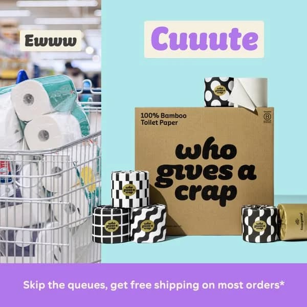
Who Gives A Crap — Split Screen Comparison — Instagram Ad Example
This ad employs a split-screen layout to create a stark "before and after" comparison, effectively contrasting the mundane chore of grocery shopping for toilet paper with the delightful experience of Who Gives A Crap. The left side uses muted, realistic tones to depict a generic shopping cart, labeled "Ewww." The right side explodes with vibrant brand colors—sky blue, purple, and bold black-and-white patterns—showcasing the product as "Cuuute." This playful color psychology and composition immediately establishes a clear value proposition and brand personality. Optimized for social platforms like Instagram, the high contrast and engaging visuals stop the scroll. Text hierarchy is simple: emotional anchors ("Ewww," "Cuuute") guide the eye, while a clear offer at the bottom banner drives consideration. The overall design leverages humor and aesthetics to differentiate a commodity product.
Why This Ad Works
Direct Visual Contrast for Immediate Impact
The split-screen design instantly communicates a problem-solution narrative. The "Ewww" side resonates with the pain points of traditional shopping, while the "Cuuute" side offers an appealing, branded alternative. This direct visual comparison is highly effective for quickly conveying brand differentiation and value in a fast-scrolling feed environment.
Playful Branding Elevates a Commodity Product
Who Gives A Crap transforms a mundane product with bold, whimsical patterns and a vibrant color palette. The "Cuuute" label reinforces this playful brand identity, making the product feel less like a necessity and more like a lifestyle choice. This approach helps the brand stand out significantly from competitors and attracts an audience seeking conscious, fun alternatives.
Clear Value Proposition Drives Consideration
The bottom banner clearly states "Skip the queues, get free shipping on most orders*". This addresses common consumer pain points (inconvenience, cost) and provides a tangible benefit. By highlighting these advantages, the ad moves beyond product aesthetics to offer practical reasons for purchase, effectively nudging viewers towards consideration or conversion.
Ad Specs
Color Palette
Original Ad Copy
How to Clone This Ad
From reference to ready-to-run ad
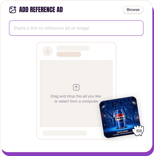
Pick a reference ad
Browse the library or upload any ad spotted in the wild.
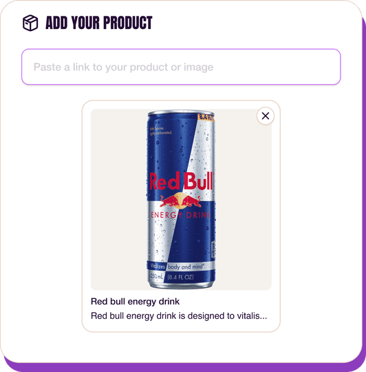
Upload a product photo
Any angle, any background. One photo is enough.
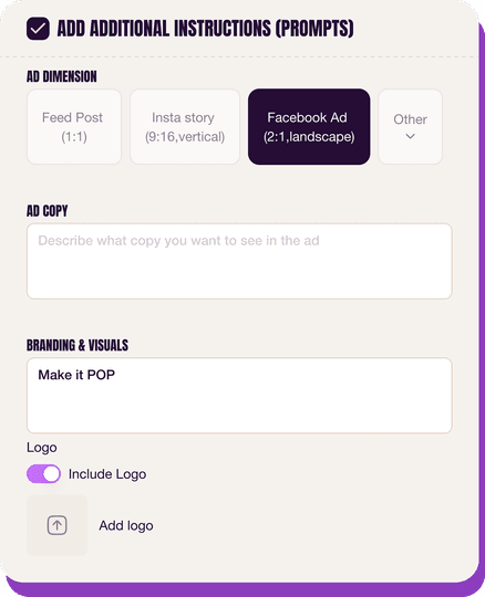
Customize the ad
Pick dimensions, add ad copy, upload your logo — AdDogs handles the rest.
Get your ad in every format, for every platform
Instagram, Facebook, TikTok, LinkedIn, Google — every ad size generated in one shot.
What You Could Improve
Clarify "Most Orders" Asterisk Detail
The asterisk next to "most orders" implies a condition that isn't immediately visible. For optimal conversion, ensure any disclaimers are either fully transparent within the ad or clearly linked. Consider a small, legible text overlay or a direct link to terms to avoid potential user friction and build trust.
Integrate a Prominent Call-to-Action Button
While the ad copy implies action, a distinct CTA button (e.g., "Shop Now," "Learn More") would significantly improve conversion rates. Social platforms are designed for clickable elements, and a clear button provides an explicit next step, guiding users directly to the purchase funnel and reducing decision fatigue.
Questions
AdDogs rebuilds the ad with your product photo and extracts your brand colors automatically from your logo. Same layout and composition — your product, your brand.
Pick your dimension per generation. Basic includes 3 dimensions: square (1:1) for Instagram and Facebook feeds, portrait (9:16) for Stories and Reels, landscape (16:9) for Google Display and YouTube. Pro and Ultimate unlock all 14, including Pinterest (2:3), cinematic (21:9), and banners.
Built for home & lifestyle products. The Split Screen composition works best when the product photo carries the persuasion. Any background, any angle — AdDogs handles the cutout.
One credit. $0.40 on the Basic plan ($12/mo for 30 credits), $0.33 on Pro. One credit produces one finished ad in the dimension you pick.
Reels ads lead on reach and CPM, carrying roughly 60% of Meta's Instagram delivery budget in 2026. Story ads win for retargeting conversion because the full-screen vertical format forces attention. Feed single-image ads still hold their ground for cold-traffic testing — cheaper to produce, faster to iterate. Carousel sits fourth but outperforms for multi-SKU DTC brands showing range.
Feed posts run 1:1 at 1080x1080 pixels or 4:5 portrait at 1080x1350. Reels and Stories need 9:16 vertical at 1080x1920. Carousel ads use 1:1 square with 2-10 slides. Running the wrong aspect ratio gets your ad letterboxed and downranked by delivery. Portrait 4:5 tends to win Feed CTR because it takes 25% more vertical screen space on mobile.
More Instagram Ad Examples
View all
By Industry
By Format
Clone Your First Ad
Pick a template. Upload your product. Seconds later, you have an ad ready to launch. No design skills. No Photoshop.
Create your ad
