Autodesk Autodesk — Architectural Comparison Split Screen — SaaS & Tech Ad Example
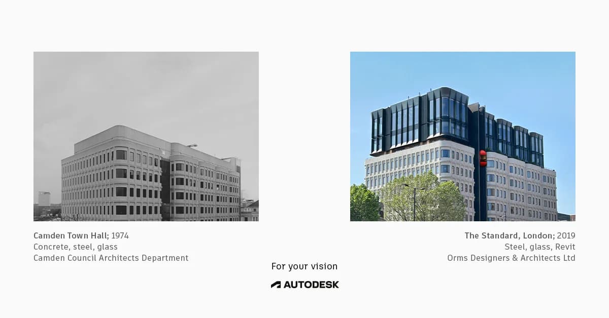
This ad employs a split-screen comparison layout to visually articulate the evolution of architectural design and the role of modern tools. The left panel, a black-and-white image of an older building, contrasts sharply with the vibrant, full-color image of a contemporary structure on the right, implicitly showcasing progress. The minimalist composition, with ample negative space, ensures focus on the architectural details and the transformation. Color psychology is used effectively to differentiate eras and highlight the modern aesthetic. Text hierarchy is subtle, providing contextual information below each image, with the brand message "For your vision" and Autodesk logo centrally placed as the unifying element. This approach is optimized for professional platforms, targeting architects and designers by demonstrating capability and inspiring future projects.
Why This Ad Works
Visual contrast highlights design evolution
The stark difference between the grayscale historical building and the vibrant, modern structure immediately conveys progress. This visual storytelling technique effectively communicates the impact of advanced design tools, implicitly positioning Autodesk as a catalyst for contemporary architectural innovation and inspiring professionals to upgrade their capabilities.
Side-by-side comparison demonstrates impact
Presenting two distinct architectural styles side-by-side creates a compelling narrative of transformation. This direct comparison allows the audience to quickly grasp the aesthetic and functional advancements over time, subtly linking Autodesk's software (Revit is mentioned) to the realization of complex, modern designs.
Minimalist layout emphasizes architectural detail
The clean, uncluttered layout with significant negative space around each image ensures that the viewer's attention remains on the buildings themselves. This focus on intricate architectural details appeals directly to the professional audience, showcasing the precision and potential enabled by design software without visual distractions.
Ad Specs
Color Palette
Original Ad Copy
How to Clone This Ad
From reference to ready-to-run ad
Pick a template
Click "Use This Template" at the top of this page.

Upload your product
Any angle, any background — AdDogs handles the cutout.
Brand auto-applied
Your colors and logo pulled straight from your brand.
Pick your dimension
14 aspect ratios on Pro and Ultimate, 3 on Free and Basic. One credit per generation.
What You Could Improve
Add a clear call to action
The ad lacks a direct call to action, which is crucial for driving engagement or conversions. Adding a button like "Learn More about Revit" or "Explore Autodesk Solutions" would guide interested professionals to the next step, improving the ad's performance in consideration or conversion campaigns.
Integrate product name more explicitly
While "Revit" is mentioned in the caption, the ad could benefit from a more prominent integration of specific Autodesk products. A headline like "Design the Future with Autodesk Revit" would immediately connect the visual transformation to the software, clarifying the offering for potential users.
Questions
AdDogs rebuilds the ad with your product photo and extracts your brand colors automatically from your logo. Same layout and composition — your product, your brand.
Pick your dimension per generation. Free and Basic include 3 dimensions: square (1:1) for Instagram and Facebook feeds, portrait (9:16) for Stories and Reels, landscape (16:9) for Google Display and YouTube. Pro and Ultimate unlock all 14, including Pinterest (2:3), cinematic (21:9), and banners.
Built for software & tools products. The Split Screen composition works best when the product photo carries the persuasion. Any background, any angle — AdDogs handles the cutout.
One credit. $0.40 on the Basic plan ($12/mo for 30 credits), $0.33 on Pro. One credit produces one finished ad in the dimension you pick. Five free credits to start, no card.
Single-image Sponsored Content at 1.91:1 (1200x627) with a screenshot-led hero and a problem-led headline dominates B2B LinkedIn CTR. Single-image beats carousel for most SaaS because LinkedIn's feed rewards fast comprehension over swipe depth. Document ads (PDF carousels) work well for gated-content funnels — HubSpot built a paid engine on this format. Sponsored video runs higher on brand-awareness but rarely beats static on cost-per-lead once you're past the discovery phase.
Grammarly runs the most prolific consumer-SaaS paid creative — the red-squiggle moment is a hook adapted across hundreds of variants. HubSpot leads B2B content-gated creative with template-download offers and pipeline screenshots. Notion and Linear hold the productivity-tool aesthetic tier with tight palette discipline. Airtable owns the spreadsheet-to-database before-after. Webflow runs designer-targeted creative with site-builder screenshots. Each brand rotates creative weekly.
More SaaS & Tech Ad Examples
View all


Similar Style in Other Categories

By Industry
By Format
Clone Your First Ad
Pick a template. Upload your product. Seconds later, you have an ad ready to launch. No design skills. No Photoshop.
Create your ad