ClickUp ClickUp — All-in-One App UI Showcase — SaaS & Tech Ad Example
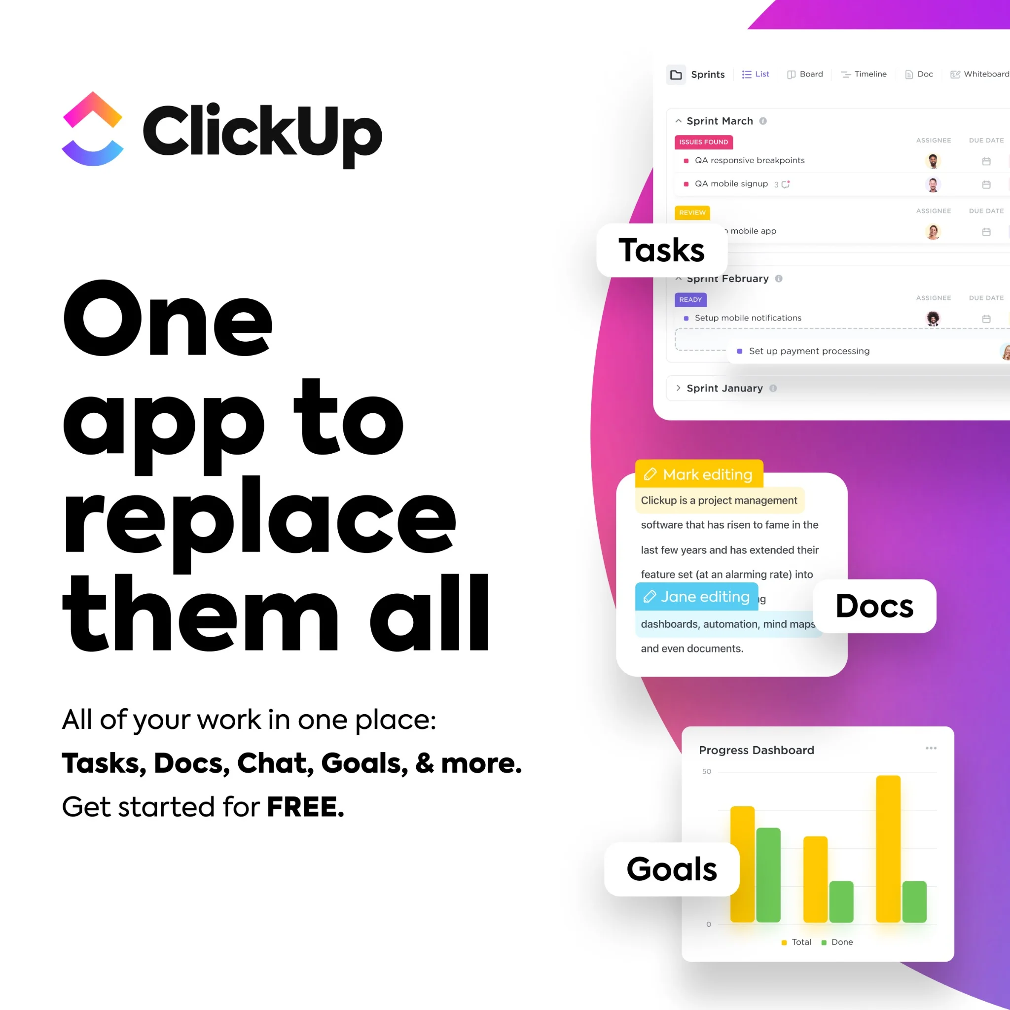
This ad employs a dynamic split-screen layout, dedicating the left to a bold, benefit-driven headline and the right to a vibrant, multi-layered UI showcase. The stark white background on the left ensures maximum readability for the core message, while the energetic purple-pink gradient on the right visually separates and highlights the product's diverse functionalities. Compositionally, the overlapping UI elements, each labeled with a key feature like "Tasks," "Docs," and "Goals," effectively demonstrates the "all-in-one" proposition without overwhelming the viewer. This design is highly optimized for platforms like Facebook or Instagram, where its high contrast and clear value proposition can quickly capture attention amidst a busy feed. The text hierarchy is clear: a dominant headline, followed by supporting bullet points, and then concise labels on the visual elements, guiding the eye through the product's breadth.
Why This Ad Works
Bold headline directly addresses pain point
The headline "One app to replace them all" immediately speaks to a common pain point for professionals juggling multiple tools. Its large, bold font on a clean white background ensures instant readability and positions ClickUp as the ultimate solution, driving immediate relevance and curiosity.
Visual demonstration of integrated features
The right side of the ad effectively uses layered UI mockups to visually represent "Tasks," "Docs," and "Goals." This technique demonstrates the product's comprehensive capabilities at a glance, reinforcing the "all-in-one" claim more powerfully than text alone and showcasing the breadth of the platform.
High contrast ensures scroll-stopping visibility
The ad leverages strong visual contrast between the clean white text area and the vibrant, gradient-filled UI section. This deliberate choice makes the ad pop in a crowded feed, drawing the eye and ensuring that both the core message and the product's visual appeal are immediately discernible, enhancing engagement.
Ad Specs
Color Palette
Original Ad Copy
How to Clone This Ad
From reference to ready-to-run ad
Pick a template
Click "Use This Template" at the top of this page.

Upload your product
Any angle, any background — AdDogs handles the cutout.
Brand auto-applied
Your colors and logo pulled straight from your brand.
Pick your dimension
14 aspect ratios on Pro and Ultimate, 3 on Free and Basic. One credit per generation.
What You Could Improve
Add a prominent, clear call-to-action button
While the ad mentions "Get started for FREE," there's no explicit CTA button. Adding a visually distinct button like "Sign Up Free" or "Learn More" would significantly improve conversion rates by providing a clear next step for interested users, reducing friction in the user journey.
Emphasize "FREE" offer with visual highlight
The "FREE" offer is present but could be more impactful. Highlighting "FREE" with a different color, bolding, or a small graphic element would draw more attention to this key incentive. This could increase click-through rates, especially for a SaaS product targeting new user acquisition.
Questions
AdDogs rebuilds the ad with your product photo and extracts your brand colors automatically from your logo. Same layout and composition — your product, your brand.
Pick your dimension per generation. Free and Basic include 3 dimensions: square (1:1) for Instagram and Facebook feeds, portrait (9:16) for Stories and Reels, landscape (16:9) for Google Display and YouTube. Pro and Ultimate unlock all 14, including Pinterest (2:3), cinematic (21:9), and banners.
Built for software & tools products. The Split Screen composition works best when the product photo carries the persuasion. Any background, any angle — AdDogs handles the cutout.
One credit. $0.40 on the Basic plan ($12/mo for 30 credits), $0.33 on Pro. One credit produces one finished ad in the dimension you pick. Five free credits to start, no card.
Single-image Sponsored Content at 1.91:1 (1200x627) with a screenshot-led hero and a problem-led headline dominates B2B LinkedIn CTR. Single-image beats carousel for most SaaS because LinkedIn's feed rewards fast comprehension over swipe depth. Document ads (PDF carousels) work well for gated-content funnels — HubSpot built a paid engine on this format. Sponsored video runs higher on brand-awareness but rarely beats static on cost-per-lead once you're past the discovery phase.
Grammarly runs the most prolific consumer-SaaS paid creative — the red-squiggle moment is a hook adapted across hundreds of variants. HubSpot leads B2B content-gated creative with template-download offers and pipeline screenshots. Notion and Linear hold the productivity-tool aesthetic tier with tight palette discipline. Airtable owns the spreadsheet-to-database before-after. Webflow runs designer-targeted creative with site-builder screenshots. Each brand rotates creative weekly.
More SaaS & Tech Ad Examples
View all


By Industry
By Format
Clone Your First Ad
Pick a template. Upload your product. Seconds later, you have an ad ready to launch. No design skills. No Photoshop.
Create your ad