
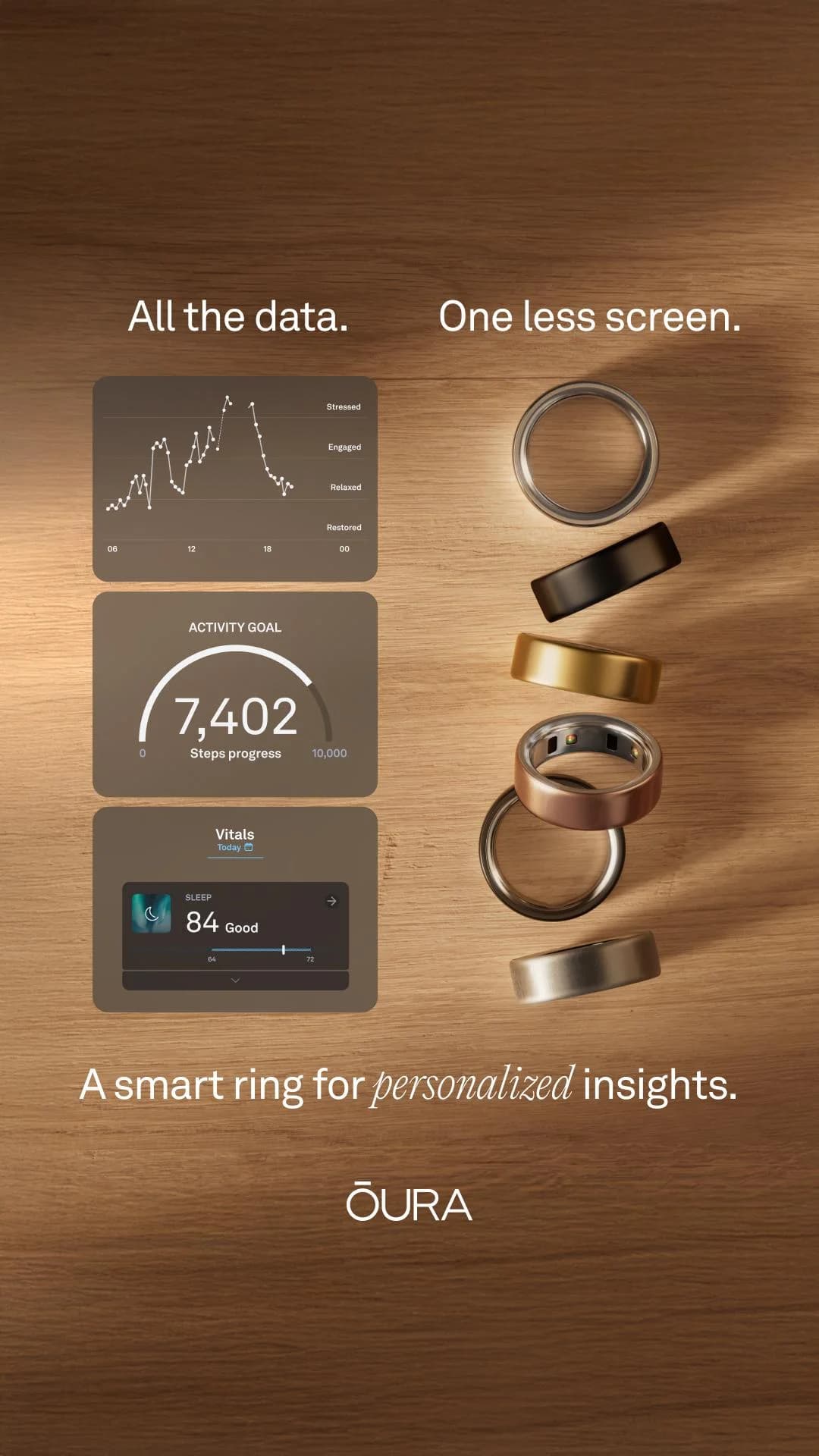
Oura Ring — Data & Product Grid — Fashion Ad Example
This ad effectively uses a split-screen layout to juxtapose the product's core value proposition: comprehensive data insights versus the discreet, screen-free form factor. The left panel showcases detailed UI elements, illustrating the depth of health tracking, while the right displays multiple Oura rings, emphasizing design variety and premium finishes. The warm wooden background provides an organic, approachable feel, contrasting with the tech-forward product. Text hierarchy is clear, with a punchy headline at the top, followed by a benefit-driven sub-headline. This composition is optimized for vertical social feeds like Instagram, where visual storytelling and clear value propositions are crucial for engagement. The ad successfully communicates both the technological sophistication and the lifestyle integration of the Oura ring, appealing to those seeking advanced wellness tracking without device distraction.
Why This Ad Works
Juxtaposition highlights core value proposition
The ad brilliantly places detailed data screens next to the minimalist rings. This visual contrast immediately communicates the Oura ring's unique selling proposition: advanced health tracking without the need for a bulky screen. It effectively answers the "what it does" and "how it does it" in one glance, appealing to tech-savvy wellness consumers.
Visualizing data builds product credibility
By showing actual UI elements with graphs and metrics, the ad provides tangible proof of the ring's capabilities. This transparency builds trust and demonstrates the depth of insights available, moving beyond abstract claims to concrete features. It reassures potential buyers about the product's analytical power.
Product variety enhances aesthetic appeal
Displaying multiple Oura rings in different finishes (silver, gold, black, rose gold) caters to diverse aesthetic preferences. This visual showcase allows viewers to imagine the ring fitting their personal style, broadening the product's appeal and encouraging consideration based on both function and fashion.
Ad Specs
Color Palette
Original Ad Copy
How to Clone This Ad
From reference to ready-to-run ad
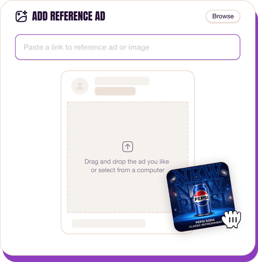
Pick a reference ad
Browse the library or upload any ad spotted in the wild.
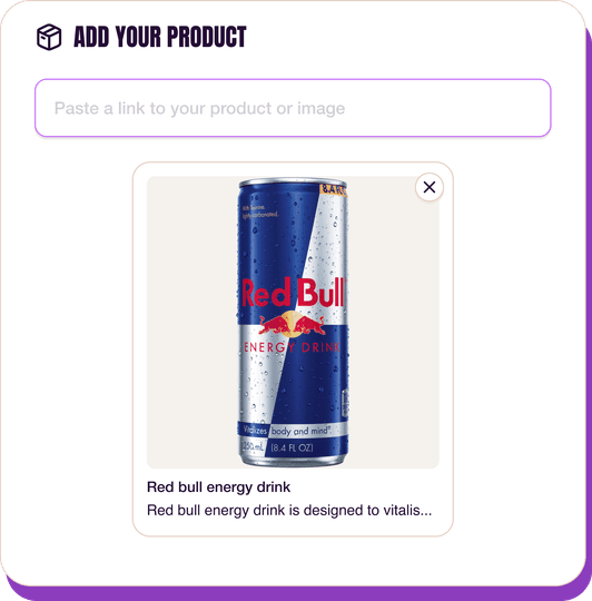
Upload a product photo
Any angle, any background. One photo is enough.
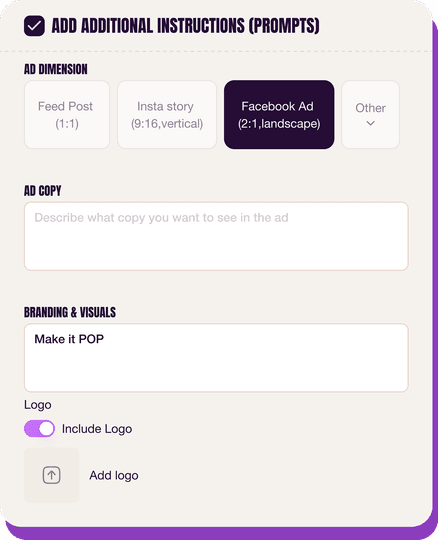
Customize the ad
Pick dimensions, add ad copy, upload your logo — AdDogs handles the rest.
Get your ad in every format, for every platform
Instagram, Facebook, TikTok, LinkedIn, Google — every ad size generated in one shot.
What You Could Improve
Integrate a clear call to action
The ad lacks an explicit CTA button or text. Adding a "Shop Now" or "Learn More" would guide interested viewers directly. For performance campaigns, a strong, visible CTA can significantly boost click-through rates and conversion efficiency by reducing decision friction.
Consider a subtle lifestyle context shot
While the data and product display is effective, a subtle lifestyle element—perhaps a hand wearing the ring—could enhance relatability. This helps customers visualize the ring in daily use, reinforcing its seamless integration and discreet nature, potentially increasing emotional connection and purchase intent.
Questions
AdDogs rebuilds the ad with your product photo and extracts your brand colors automatically from your logo. Same layout and composition — your product, your brand.
Pick your dimension per generation. Basic includes 3 dimensions: square (1:1) for Instagram and Facebook feeds, portrait (9:16) for Stories and Reels, landscape (16:9) for Google Display and YouTube. Pro and Ultimate unlock all 14, including Pinterest (2:3), cinematic (21:9), and banners.
Built for health & wellness and fashion & apparel products. The Split Screen composition works best when the product photo carries the persuasion. Any background, any angle — AdDogs handles the cutout.
One credit. $0.40 on the Basic plan ($12/mo for 30 credits), $0.33 on Pro. One credit produces one finished ad in the dimension you pick.
Fit-comparison split frames and on-model lifestyle — in that order for direct-response, reversed for brand-builders. Fit-comparison teaches shoppers why your cut is worth the price tag in under two seconds. Lifestyle builds long-term aided recall. Skip studio-on-white product shots at launch — they read as Amazon, not as brand.
True Classic, Quince, and Mack Weldon lead men's DTC. Aritzia, Vuori, and Alo Yoga lead women's premium athleisure. Everlane and Skims run the heaviest transparency-priced and shapewear spend respectively. Each brand has a weekly creative rotation worth studying — True Classic alone runs 200+ active variants at any time on Meta.
More Fashion Ad Examples
View all




By Industry
By Format
Clone Your First Ad
Pick a template. Upload your product. Seconds later, you have an ad ready to launch. No design skills. No Photoshop.
Create your ad
