
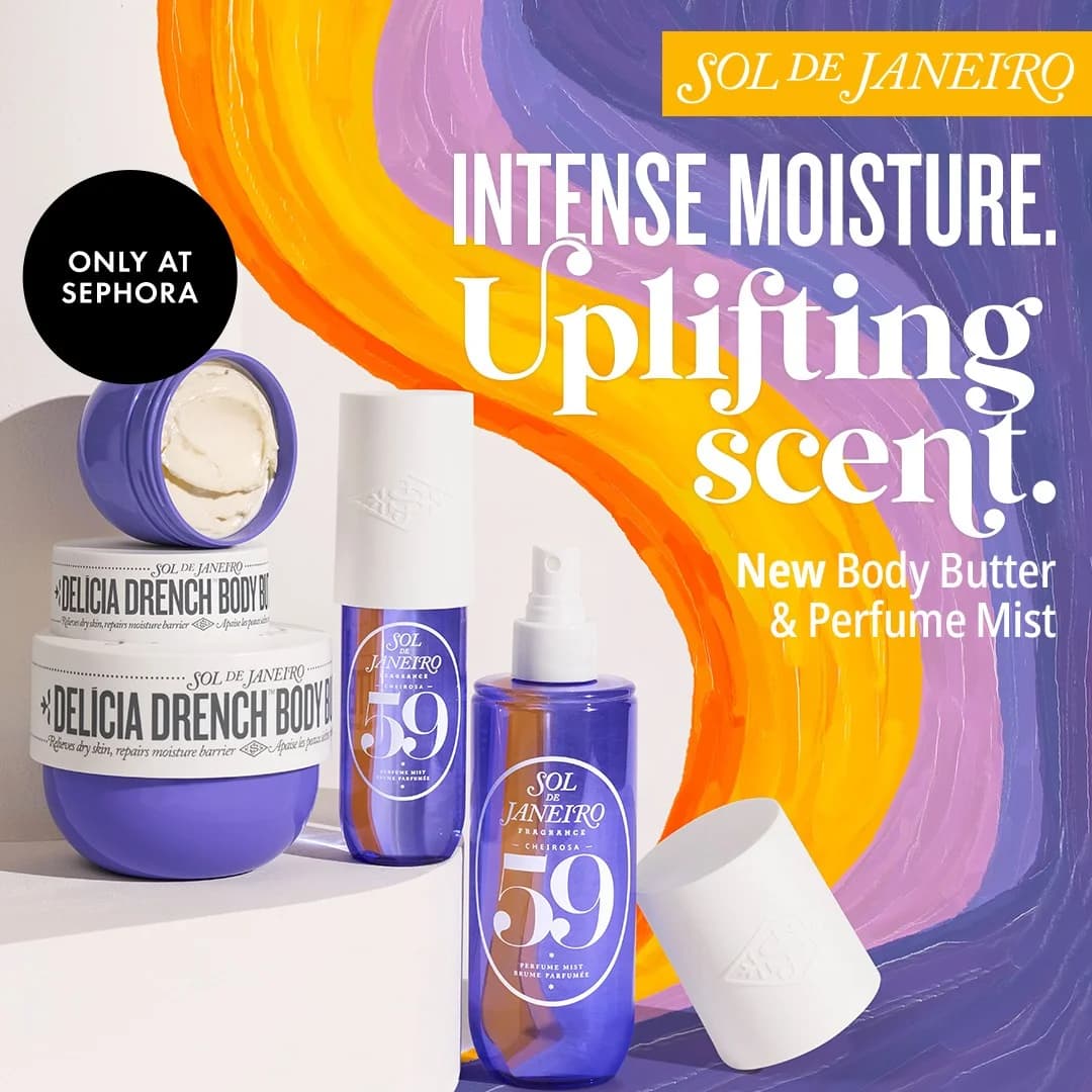
Sol de Janeiro — Vibrant Product Launch Layout — Fashion Ad Example
This ad effectively leverages a vibrant, dynamic background to create immediate visual interest, crucial for social media feeds. The swirling purple, orange, and yellow hues evoke a sense of energy and warmth, aligning with the brand's Brazilian-inspired identity and the "uplifting scent" claim. Products are strategically grouped on the left, creating a clear focal point, while the bold, contrasting text on the right guides the eye through the key benefits and new product announcement. The "ONLY AT SEPHORA" badge adds an exclusivity layer, driving urgency and perceived value. Compositionally, the diagonal background creates movement, preventing the static image from feeling flat. Text hierarchy is clear: brand, main benefits, new product, and retail exclusivity. This design is optimized for platforms like Instagram, where bright, engaging visuals and clear value propositions capture attention quickly and effectively.
Why This Ad Works
Dynamic, vibrant background grabs attention
The swirling, multi-colored background immediately captures the eye, standing out against typical feed content. This vibrant, energetic aesthetic aligns perfectly with Sol de Janeiro's brand identity, creating an emotional connection and communicating the "uplifting" aspect of the product before the text is even read.
Clear product focus and launch messaging
The products are well-arranged, showcasing both the new body butter and perfume mist clearly. The prominent "New Body Butter & Perfume Mist" text directly addresses the launch, ensuring viewers understand the ad's purpose. This clarity is vital for driving consideration for new offerings in a crowded market.
Exclusivity call-out drives urgency
The "ONLY AT SEPHORA" badge creates a sense of limited availability and premium access. This exclusivity can motivate immediate action by implying a unique offering not found elsewhere. For beauty consumers, Sephora's endorsement also adds a layer of trusted retail validation, enhancing product appeal.
Ad Specs
Color Palette
Original Ad Copy
How to Clone This Ad
From reference to ready-to-run ad
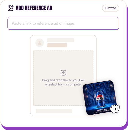
Pick a reference ad
Browse the library or upload any ad spotted in the wild.
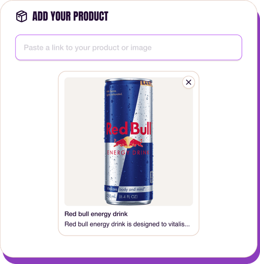
Upload a product photo
Any angle, any background. One photo is enough.
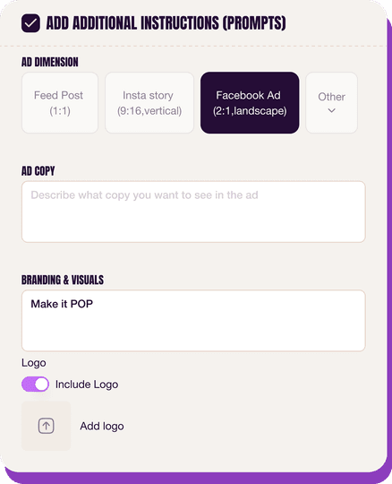
Customize the ad
Pick dimensions, add ad copy, upload your logo — AdDogs handles the rest.
Get your ad in every format, for every platform
Instagram, Facebook, TikTok, LinkedIn, Google — every ad size generated in one shot.
What You Could Improve
Enhance text contrast for readability
The white "Uplifting scent" text against the bright yellow background, especially where the yellow is lighter, can be challenging to read quickly. Adding a subtle drop shadow or a thin, contrasting outline to this specific text could significantly improve legibility without sacrificing the vibrant aesthetic.
Integrate lifestyle element for aspirational connection
While the product shot is strong, integrating a subtle lifestyle element, like a hand applying the cream or a hint of a beach setting, could further reinforce the "uplifting" and "Brazilian-inspired" brand story. This helps consumers visualize the product's benefits, boosting emotional resonance and relatability.
Questions
AdDogs rebuilds the ad with your product photo and extracts your brand colors automatically from your logo. Same layout and composition — your product, your brand.
Pick your dimension per generation. Basic includes 3 dimensions: square (1:1) for Instagram and Facebook feeds, portrait (9:16) for Stories and Reels, landscape (16:9) for Google Display and YouTube. Pro and Ultimate unlock all 14, including Pinterest (2:3), cinematic (21:9), and banners.
Built for health & wellness and fashion & apparel products. The Product on Background composition works best when the product photo carries the persuasion. Any background, any angle — AdDogs handles the cutout.
One credit. $0.40 on the Basic plan ($12/mo for 30 credits), $0.33 on Pro. One credit produces one finished ad in the dimension you pick.
Fit-comparison split frames and on-model lifestyle — in that order for direct-response, reversed for brand-builders. Fit-comparison teaches shoppers why your cut is worth the price tag in under two seconds. Lifestyle builds long-term aided recall. Skip studio-on-white product shots at launch — they read as Amazon, not as brand.
True Classic, Quince, and Mack Weldon lead men's DTC. Aritzia, Vuori, and Alo Yoga lead women's premium athleisure. Everlane and Skims run the heaviest transparency-priced and shapewear spend respectively. Each brand has a weekly creative rotation worth studying — True Classic alone runs 200+ active variants at any time on Meta.
More Fashion Ad Examples
View all
Similar Style in Other Categories


By Industry
By Format
Clone Your First Ad
Pick a template. Upload your product. Seconds later, you have an ad ready to launch. No design skills. No Photoshop.
Create your ad
