
Made In Cookware Made In Carbon Steel Pan — Feature Spotlight — Home Decor Ad Example
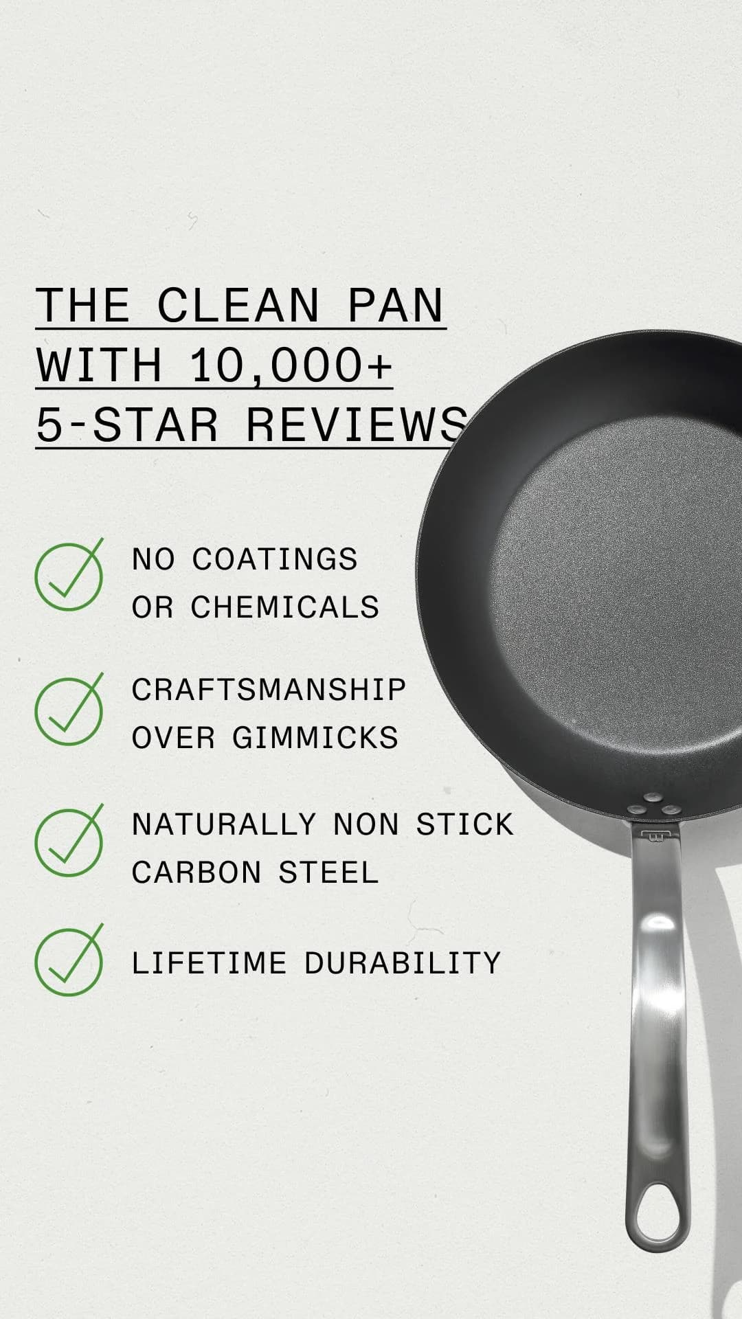
This ad employs a clean split-screen layout, dedicating the left half to compelling text and the right to a hero shot of the Made In carbon steel pan. The muted, off-white background enhances the product's dark, metallic finish, creating strong contrast and a sense of premium quality. This minimalist color palette signals sophistication and allows the product's material honesty to shine through. Green checkmarks visually reinforce key benefits, guiding the eye down the list of features, leveraging color psychology for trust and affirmation. The composition is optimized for vertical platforms like Instagram, ensuring the product and all text are clearly visible without cropping, maximizing mobile impact. Text hierarchy is clear: a bold, underlined headline immediately establishes social proof and a key benefit, followed by easily digestible bullet points. This direct approach ensures rapid information absorption, crucial for scroll-heavy feeds. The overall strategy focuses on transparent feature communication, building confidence in the product's inherent quality rather than relying on flashy visuals.
Why This Ad Works
Split-screen layout for clear communication
The ad effectively uses a split-screen format, dedicating the left side to concise, benefit-driven text and the right to a high-quality product image. This clear division prevents visual clutter, allowing the viewer to easily process both the product's aesthetic and its core value propositions, enhancing message retention.
Social proof headline builds immediate trust
The headline "THE CLEAN PAN WITH 10,000+ 5-STAR REVIEWS" immediately establishes strong social proof. This quantitative validation from a large user base instills confidence and credibility from the outset, significantly reducing perceived risk for potential buyers and encouraging further engagement with the ad's details.
Green checkmarks emphasize key benefits
Utilizing green checkmarks next to each feature bullet point is a powerful psychological cue. Green signifies approval, health, and positivity, while the checkmark visually confirms the presence of a desirable attribute. This technique makes the benefits instantly recognizable and trustworthy, improving scanability and comprehension.
Ad Specs
Color Palette
Original Ad Copy
How to Clone This Ad
From reference to ready-to-run ad
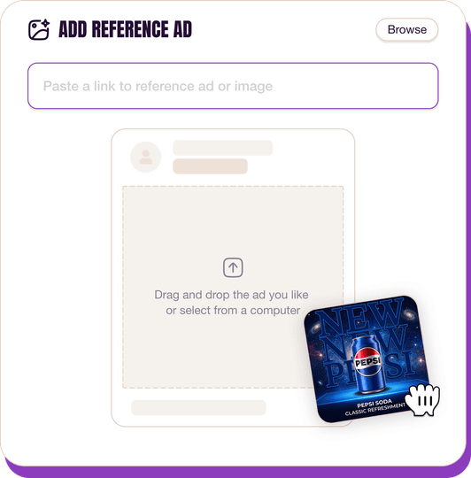
Pick a reference ad
Browse the library or upload any ad spotted in the wild.
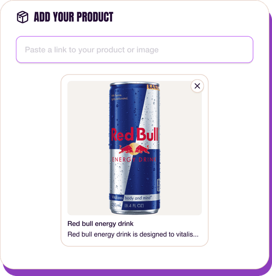
Upload a product photo
Any angle, any background. One photo is enough.
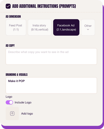
Customize the ad
Pick dimensions, add ad copy, upload your logo — AdDogs handles the rest.
Get your ad in every format, for every platform
Instagram, Facebook, TikTok, LinkedIn, Google — every ad size generated in one shot.
What You Could Improve
Add a clear call-to-action button
The ad lacks an explicit call-to-action button within the image itself. While platforms provide CTA options, embedding a "Shop Now" or "Learn More" directly on the creative can significantly increase click-through rates by guiding the user's next step more directly and reducing decision friction.
Incorporate a lifestyle or in-use shot
While the hero shot is clean, adding a secondary image or a variant showing the pan in a real kitchen setting or in use could enhance aspirational appeal. This helps potential customers visualize themselves using the product, fostering a stronger emotional connection and demonstrating its practical application.
Questions
AdDogs rebuilds the ad with your product photo and extracts your brand colors automatically from your logo. Same layout and composition — your product, your brand.
Pick your dimension per generation. Basic includes 3 dimensions: square (1:1) for Instagram and Facebook feeds, portrait (9:16) for Stories and Reels, landscape (16:9) for Google Display and YouTube. Pro and Ultimate unlock all 14, including Pinterest (2:3), cinematic (21:9), and banners.
Built for home & lifestyle and food & beverage products. The Split Screen composition works best when the product photo carries the persuasion. Any background, any angle — AdDogs handles the cutout.
One credit. $0.40 on the Basic plan ($12/mo for 30 credits), $0.33 on Pro. One credit produces one finished ad in the dimension you pick.
Disproportionately well. Pinterest users are already in research-and-inspiration mode for home decor — unlike Meta, where they're scrolling casually. A strong Pinterest ad looks more like a mood board pin than a paid ad. Vertical 2:3 aspect ratio, room-context photo, soft brand callout. Parachute, Brooklinen, and Article all run meaningful Pinterest spend in the low-to-mid six figures monthly.
Portrait 4:5 (1080x1350) for Instagram feed matches how rooms are often photographed. 1:1 for Facebook feed and grid. 2:3 (1000x1500) for Pinterest. 9:16 for Reels and Stories. Video walk-throughs of a styled room outperform static images on Reels by a significant margin — the camera movement mimics how a human would scan the space.
More Home Decor Ad Examples
View all
By Industry
By Format
Clone Your First Ad
Pick a template. Upload your product. Seconds later, you have an ad ready to launch. No design skills. No Photoshop.
Create your ad
