Webflow Webflow — Problem-Solution Statistic Layout — SaaS & Tech Ad Example
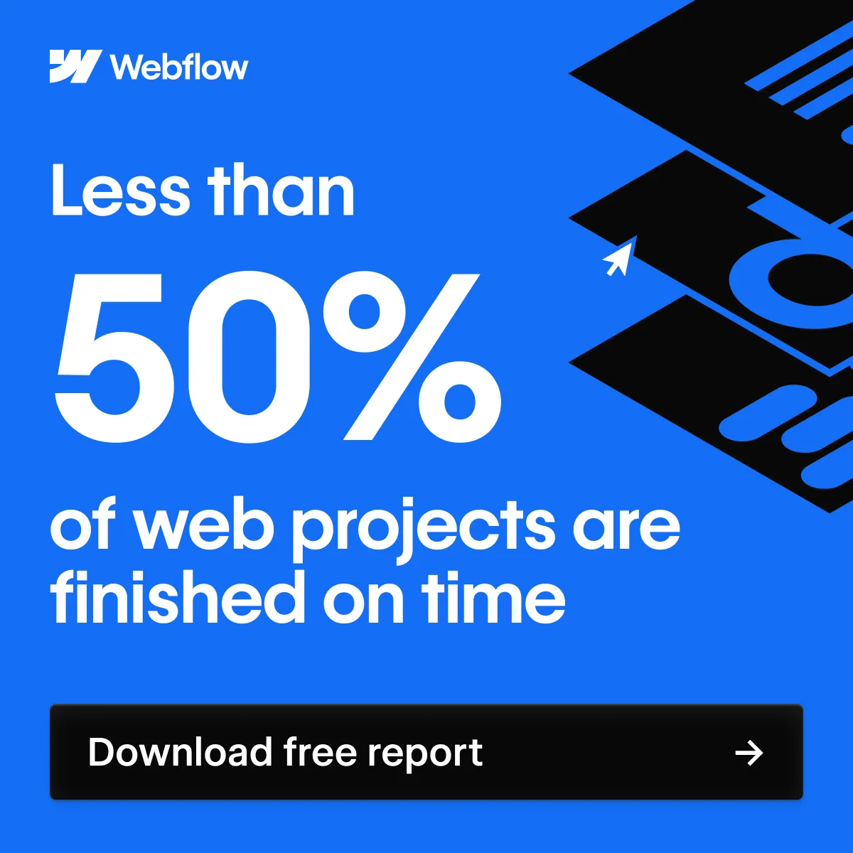
This ad effectively leverages a bold, high-contrast design to capture attention and communicate a critical industry pain point. The layout strategically places a large, impactful statistic at its core, immediately drawing the viewer's eye. The vibrant blue background, paired with crisp white text, creates strong visual contrast, enhancing readability and conveying professionalism. A subtle, abstract graphic in the upper right corner hints at web development without distracting from the main message. Text hierarchy is clear: brand logo, then the dominant statistic, followed by a direct call-to-action. This design is optimized for platforms like Facebook or LinkedIn, where a clear, concise message and strong visual appeal are crucial for stopping the scroll and driving consideration.
Why This Ad Works
Bold Statistic Drives Immediate Engagement
The "Less than 50%" statistic is prominently displayed in a large, white font against a vibrant blue background. This creates an immediate, attention-grabbing problem statement, resonating with professionals who likely experience project delays, prompting them to seek a solution.
High-Contrast Palette Enhances Readability
The use of a bright blue background with stark white text, complemented by a black CTA button, ensures maximum readability. This high contrast is crucial for mobile viewing, making the message instantly digestible and professional, aligning with a B2B audience's expectation for clarity and efficiency.
Clear Problem-Solution Flow
The ad presents a common industry problem ("Less than 50% of web projects are finished on time") and immediately offers a path to a solution via the "Download free report" CTA. This direct approach guides the viewer from recognizing a pain point to taking an actionable step towards resolution.
Ad Specs
Color Palette
Original Ad Copy
How to Clone This Ad
From reference to ready-to-run ad
Pick a template
Click "Use This Template" at the top of this page.

Upload your product
Any angle, any background — AdDogs handles the cutout.
Brand auto-applied
Your colors and logo pulled straight from your brand.
Pick your dimension
14 aspect ratios on Pro and Ultimate, 3 on Free and Basic. One credit per generation.
What You Could Improve
Add a Benefit-Oriented Sub-Headline
While the statistic is strong, adding a short sub-headline (e.g., "Discover how to beat the odds" or "Unlock strategies for on-time delivery") above the CTA could increase click-through rates. This would provide a clearer incentive for downloading the report beyond just addressing the problem.
Test a More Engaging Graphic Element
The current abstract graphic is subtle but could be more dynamic or directly illustrative of project management or efficiency. A/B testing variants with a graphic that visually represents "on-time delivery" or "streamlined workflow" might enhance the ad's overall narrative and appeal to visual learners.
Questions
AdDogs rebuilds the ad with your product photo and extracts your brand colors automatically from your logo. Same layout and composition — your product, your brand.
Pick your dimension per generation. Free and Basic include 3 dimensions: square (1:1) for Instagram and Facebook feeds, portrait (9:16) for Stories and Reels, landscape (16:9) for Google Display and YouTube. Pro and Ultimate unlock all 14, including Pinterest (2:3), cinematic (21:9), and banners.
Built for software & tools products. The Text-Heavy composition works best when the product photo carries the persuasion. Any background, any angle — AdDogs handles the cutout.
One credit. $0.40 on the Basic plan ($12/mo for 30 credits), $0.33 on Pro. One credit produces one finished ad in the dimension you pick. Five free credits to start, no card.
Single-image Sponsored Content at 1.91:1 (1200x627) with a screenshot-led hero and a problem-led headline dominates B2B LinkedIn CTR. Single-image beats carousel for most SaaS because LinkedIn's feed rewards fast comprehension over swipe depth. Document ads (PDF carousels) work well for gated-content funnels — HubSpot built a paid engine on this format. Sponsored video runs higher on brand-awareness but rarely beats static on cost-per-lead once you're past the discovery phase.
Grammarly runs the most prolific consumer-SaaS paid creative — the red-squiggle moment is a hook adapted across hundreds of variants. HubSpot leads B2B content-gated creative with template-download offers and pipeline screenshots. Notion and Linear hold the productivity-tool aesthetic tier with tight palette discipline. Airtable owns the spreadsheet-to-database before-after. Webflow runs designer-targeted creative with site-builder screenshots. Each brand rotates creative weekly.
More SaaS & Tech Ad Examples
View all


Similar Style in Other Categories

By Industry
By Format
Clone Your First Ad
Pick a template. Upload your product. Seconds later, you have an ad ready to launch. No design skills. No Photoshop.
Create your ad