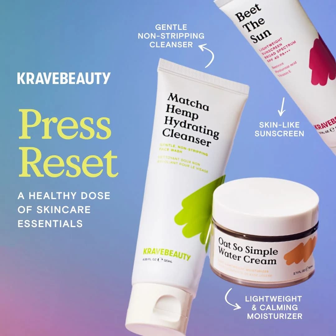
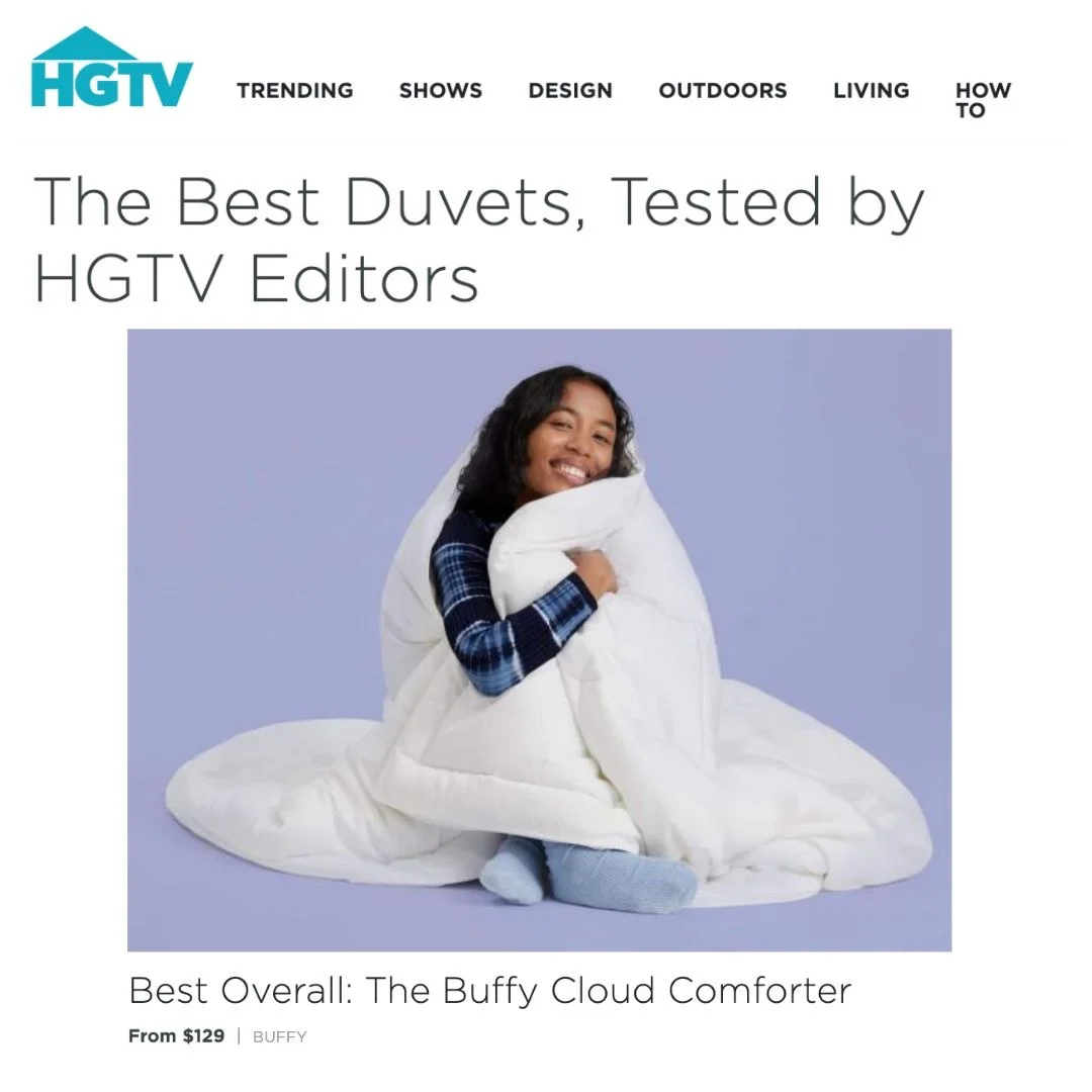
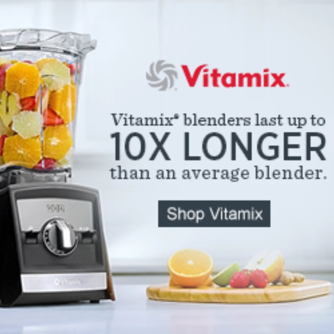
KraveBeauty KraveBeauty Skincare Essentials — Angled Product Showcase — Skincare Ad Example
The ad utilizes an angled product showcase layout against a vibrant gradient background, effectively highlighting three distinct skincare products. The composition employs a dynamic diagonal arrangement, guiding the eye from the top-right to the bottom-left, where the main call to action text resides. Color psychology is leveraged through the bright, clean product packaging contrasting with the playful blue-to-pink gradient, signaling freshness and approachability. Text hierarchy is clear: the brand name is prominent, followed by a bold, yellow headline ("Press Reset") and a supportive sub-headline, ensuring key messages are easily digestible. Arrows and short benefit descriptions enhance product understanding. This design is optimized for platforms like Instagram, where visually engaging, informative content with a clean aesthetic performs well, encouraging scroll-stopping engagement and product discovery. The overall effect is inviting and educational.
Why This Ad Works
Dynamic Diagonal Composition Guides Eye
The angled arrangement of products creates a natural visual flow, leading the viewer's eye across the ad. This dynamic composition prevents static boredom and ensures each product, along with its associated benefit text, is encountered sequentially, enhancing message retention and overall ad engagement.
Vibrant Gradient Background Creates Contrast
The blue-to-pink gradient background provides a lively yet clean canvas that makes the white product packaging pop. This high contrast ensures product visibility and adds a modern, playful touch, appealing to a younger, digitally native audience on social platforms, increasing scroll-stopping power.
Clear Product-Benefit Association with Arrows
The use of arrows directly linking each product to its key benefit ("Gentle Non-Stripping Cleanser," "Skin-Like Sunscreen," "Lightweight & Calming Moisturizer") simplifies complex information. This visual cue enhances clarity and allows for quick comprehension of each product's primary value proposition, aiding rapid decision-making.
Ad Specs
Color Palette
Original Ad Copy
How to Clone This Ad
From reference to ready-to-run ad
Pick a template
Click "Use This Template" at the top of this page.

Upload your product
Any angle, any background — AdDogs handles the cutout.
Brand auto-applied
Your colors and logo pulled straight from your brand.
Pick your dimension
14 aspect ratios on Pro and Ultimate, 3 on Free and Basic. One credit per generation.
What You Could Improve
Integrate a Stronger Call to Action (CTA)
While "Press Reset" is evocative, the ad lacks a direct CTA button or explicit instruction. Adding a clear "Shop Now" or "Learn More" would guide interested viewers to the next step, significantly improving conversion potential for consideration campaigns by reducing friction.
Consider a Lifestyle Element for Relatability
The ad is product-focused. Introducing a subtle human element, like a hand holding a product or a hint of skin texture, could increase relatability and emotional connection. This could make the benefits feel more tangible and aspirational for the target audience, boosting engagement.
Questions
AdDogs rebuilds the ad with your product photo and extracts your brand colors automatically from your logo. Same layout and composition — your product, your brand.
Pick your dimension per generation. Free and Basic include 3 dimensions: square (1:1) for Instagram and Facebook feeds, portrait (9:16) for Stories and Reels, landscape (16:9) for Google Display and YouTube. Pro and Ultimate unlock all 14, including Pinterest (2:3), cinematic (21:9), and banners.
Built for health & wellness and fashion & apparel products. The Product on Background composition works best when the product photo carries the persuasion. Any background, any angle — AdDogs handles the cutout.
One credit. $0.40 on the Basic plan ($12/mo for 30 credits), $0.33 on Pro. One credit produces one finished ad in the dimension you pick. Five free credits to start, no card.
Split-screen before-afters still top every CTR benchmark for skincare, followed by close-up texture pours (serum drops, cream swatches) and carousel routines that walk through an AM or PM lineup. Static hero shots on white are the weakest format — they read as stock catalog. Reels-native vertical video with a single-hand application shot has overtaken static carousel in Gen-Z audiences over the last 18 months.
Instagram Reels and Stories are non-negotiable — that's where skincare shoppers live. TikTok next for anyone targeting under 30, where dermfluencer-style UGC dominates. Pinterest converts well on routine and ingredient-research content. Hold off on YouTube pre-roll and Meta search until you've validated creative on Reels. A cold Reels campaign with $500 spend tells you more about product-market fit than a month of Pinterest.
More Skincare Ad Examples
View all

By Industry
By Format
Clone Your First Ad
Pick a template. Upload your product. Seconds later, you have an ad ready to launch. No design skills. No Photoshop.
Create your ad