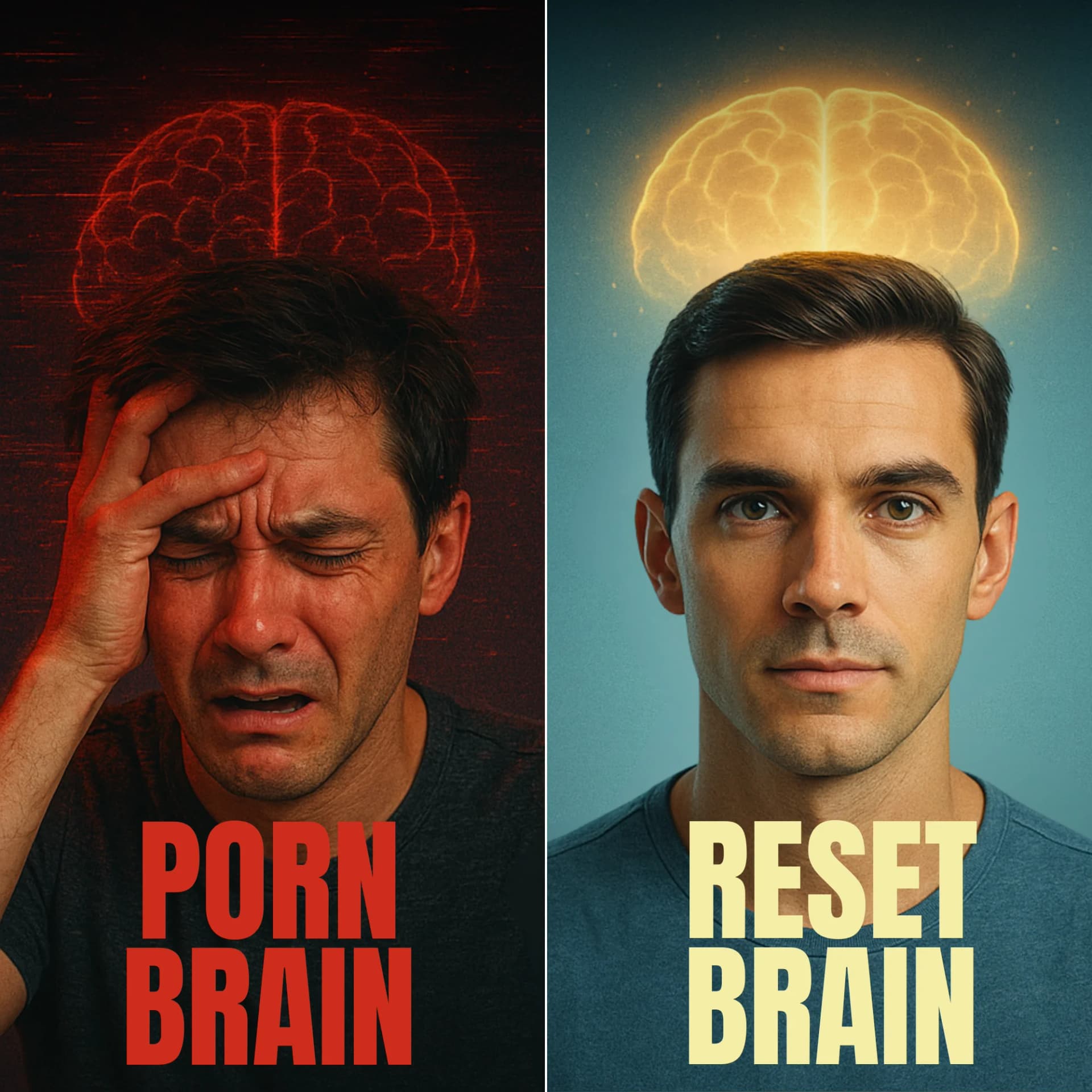
Porn Brain vs. Reset Brain — Before/After Split — Skincare Ad Example
This ad employs a powerful split-screen, before/after layout to visually communicate a transformation. The left panel uses a distressed facial expression, dark red lighting, and a glitchy red brain outline with "Porn Brain" text, immediately evoking pain and a problem state. The right panel contrasts sharply with a calm, confident expression, clear blue lighting, and a bright yellow glowing brain with "Reset Brain" text, signaling a solution and positive outcome. This direct visual juxtaposition leverages color psychology—red for warning/distress, blue for calm, yellow for clarity/enlightenment—to create an immediate emotional impact. The bold, high-contrast text ensures readability and reinforces the core message, making it highly effective for scroll-stopping on platforms like Instagram or Facebook where quick comprehension is key. The composition guides the eye from problem to solution, optimizing for rapid understanding of the value proposition.
Why This Ad Works
Direct Visual Contrast for Problem/Solution
The split-screen design immediately presents a stark before-and-after narrative. This visual shorthand allows viewers to instantly grasp the problem (distress, "Porn Brain") and the desired solution (calm, "Reset Brain") without needing extensive copy. This rapid comprehension is crucial for engaging audiences on fast-paced social feeds.
Emotional Resonance Through Facial Expressions
The contrasting facial expressions—distress and pain on the left versus calm and confidence on the right—create a strong emotional connection. Viewers experiencing similar struggles can instantly identify with the "before" state, while the "after" offers a clear, aspirational vision of relief and improvement. This emotional mirroring drives engagement.
Strategic Color Psychology Reinforces Message
The ad masterfully uses color psychology: deep, glitchy red on the left signifies danger, pain, and a disordered state, while the serene blue background and bright, glowing yellow brain on the right represent clarity, peace, and enlightenment. This color contrast powerfully amplifies the problem-solution narrative, making the ad's intent unmistakable.
Ad Specs
Color Palette
How to Clone This Ad
From reference to ready-to-run ad
Pick a template
Click "Use This Template" at the top of this page.

Upload your product
Any angle, any background — AdDogs handles the cutout.
Brand auto-applied
Your colors and logo pulled straight from your brand.
Pick your dimension
14 aspect ratios on Pro and Ultimate, 3 on Free and Basic. One credit per generation.
What You Could Improve
Add Clear Call-to-Action for Next Steps
While the ad effectively highlights a problem and solution, it lacks a clear call-to-action (CTA). Adding a button like "Learn More" or "Start Your Reset" would guide interested viewers to the next stage of the conversion funnel, significantly improving click-through rates and user journey clarity.
Introduce Brand Identity or Program Name
The ad currently focuses solely on the concept. Introducing a subtle brand logo or the specific name of the program/product being offered would help build brand recognition and provide context. This allows viewers to associate the solution with a tangible entity, making it easier to recall and search for later.
Questions
AdDogs rebuilds the ad with your product photo and extracts your brand colors automatically from your logo. Same layout and composition — your product, your brand.
Pick your dimension per generation. Free and Basic include 3 dimensions: square (1:1) for Instagram and Facebook feeds, portrait (9:16) for Stories and Reels, landscape (16:9) for Google Display and YouTube. Pro and Ultimate unlock all 14, including Pinterest (2:3), cinematic (21:9), and banners.
Built for health & wellness products. The Before/After composition works best when the product photo carries the persuasion. Any background, any angle — AdDogs handles the cutout.
One credit. $0.40 on the Basic plan ($12/mo for 30 credits), $0.33 on Pro. One credit produces one finished ad in the dimension you pick. Five free credits to start, no card.
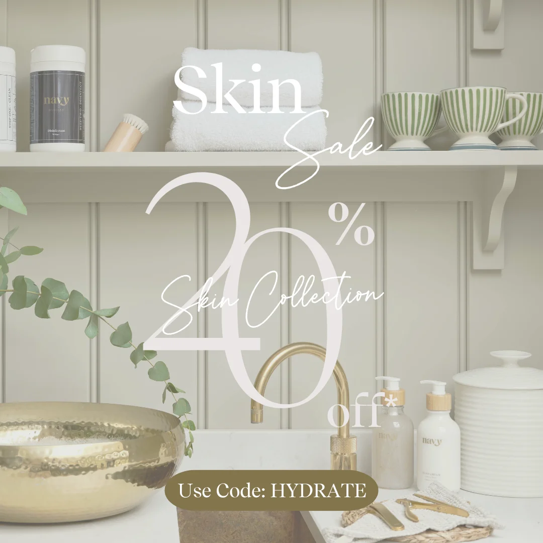
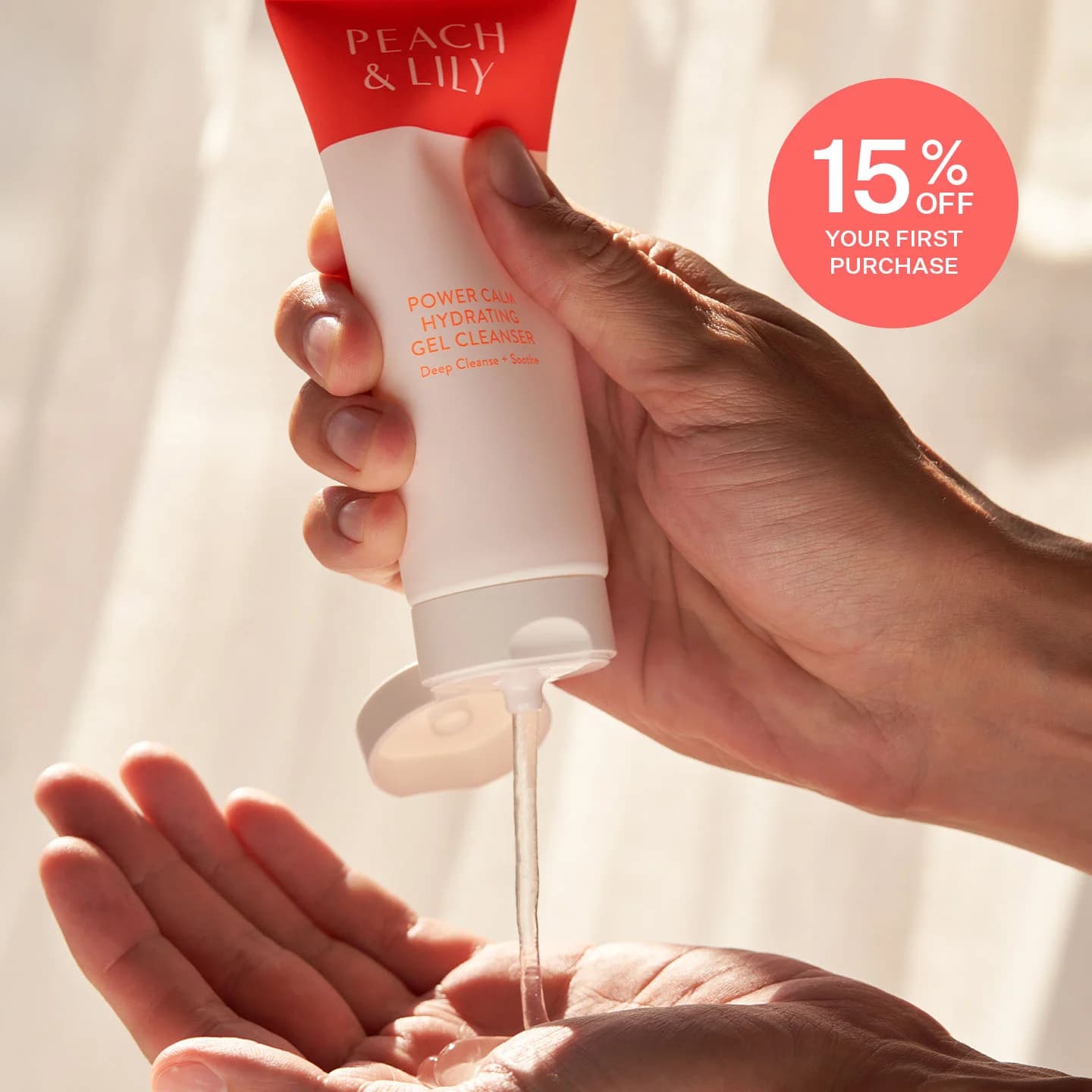
Split-screen before-afters still top every CTR benchmark for skincare, followed by close-up texture pours (serum drops, cream swatches) and carousel routines that walk through an AM or PM lineup. Static hero shots on white are the weakest format — they read as stock catalog. Reels-native vertical video with a single-hand application shot has overtaken static carousel in Gen-Z audiences over the last 18 months.
Instagram Reels and Stories are non-negotiable — that's where skincare shoppers live. TikTok next for anyone targeting under 30, where dermfluencer-style UGC dominates. Pinterest converts well on routine and ingredient-research content. Hold off on YouTube pre-roll and Meta search until you've validated creative on Reels. A cold Reels campaign with $500 spend tells you more about product-market fit than a month of Pinterest.
More Skincare Ad Examples
View all
By Industry
By Format
Clone Your First Ad
Pick a template. Upload your product. Seconds later, you have an ad ready to launch. No design skills. No Photoshop.
Create your ad