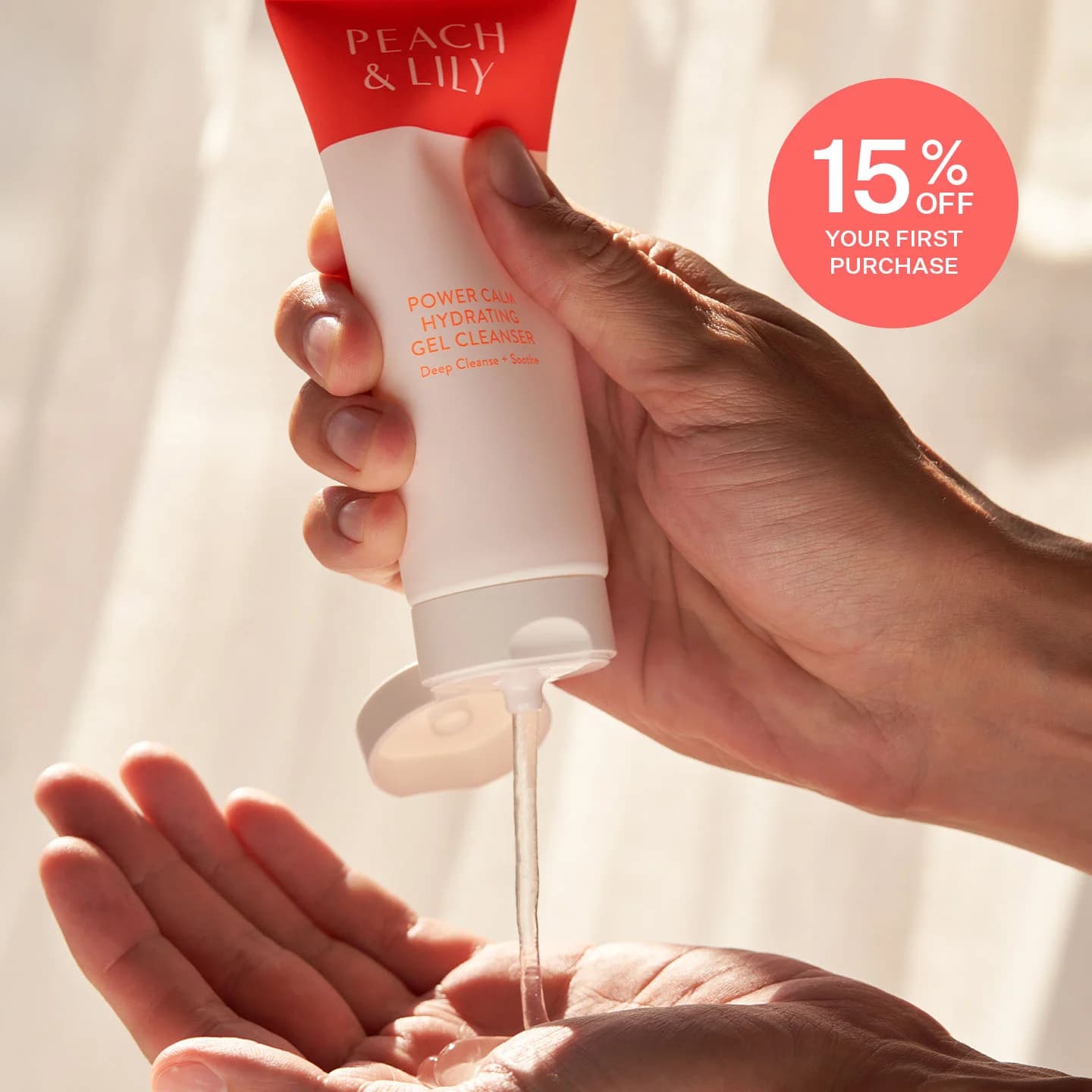
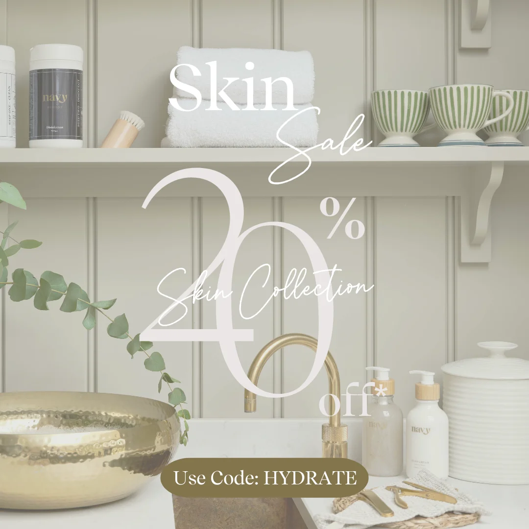
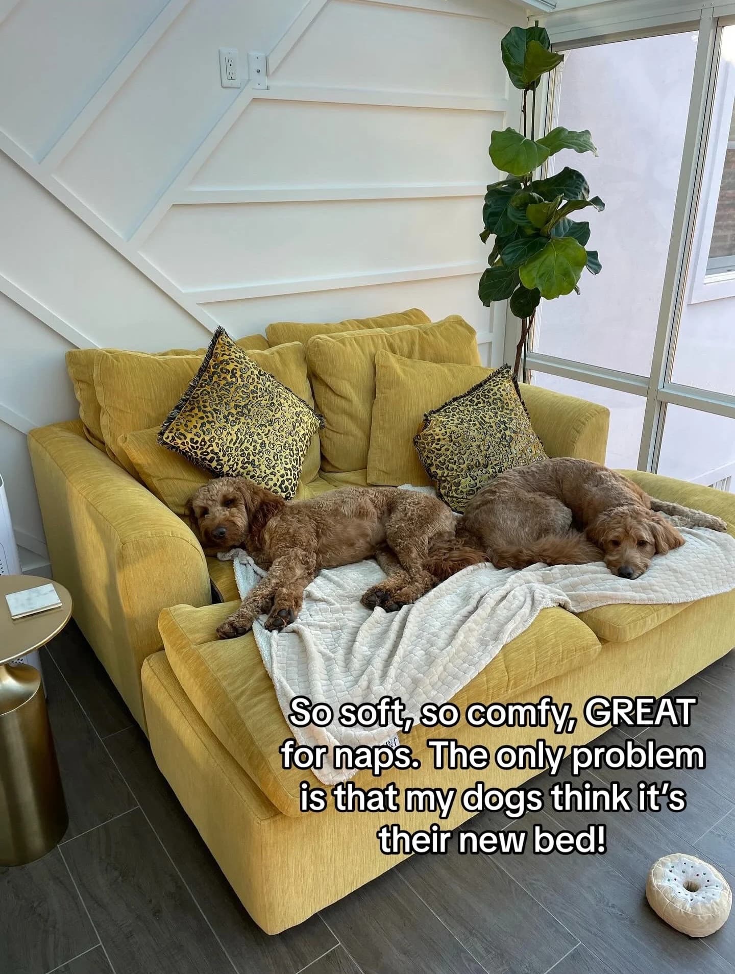
Peach & Lily Peach & Lily Cleanser — In-Use Application Shot — Skincare Ad Example
This ad effectively uses an in-use product demonstration to build trust and illustrate texture. The composition centers on hands dispensing the gel cleanser, creating an intimate, relatable moment. Warm, natural lighting highlights the product's clear, hydrating consistency, reinforcing its gentle and effective qualities. The coral and white color palette of the packaging, echoed by the discount bubble, creates a cohesive brand identity that feels fresh and approachable. Text hierarchy places the brand and product name clearly on the tube, while a prominent "15% OFF" bubble acts as the primary call to value. Optimized for visual platforms like Instagram, this ad leverages authentic-feeling imagery to stop the scroll and drive immediate conversion through a clear incentive. The focus on hands and product texture communicates efficacy without needing excessive text.
Why This Ad Works
In-use demonstration builds product trust
Showing the product actively being used, with the gel dispensing into hands, provides immediate visual proof of its texture and application. This direct demonstration helps potential customers visualize themselves using the product, reducing purchase friction and building confidence in its hydrating claims more effectively than a static product shot.
Warm, natural lighting enhances organic appeal
The soft, warm lighting creates a natural and inviting atmosphere. It suggests a gentle, effective product that aligns with clean beauty trends. This aesthetic choice makes the product feel more approachable and less clinical, appealing to consumers seeking a holistic and pleasant skincare experience, enhancing brand perception.
Prominent discount call-out drives immediate action
The bright coral "15% OFF YOUR FIRST PURCHASE" bubble immediately grabs attention and clearly communicates a strong incentive. Placed strategically in the upper right, it acts as a secondary focal point after the product, directly addressing conversion. This clear, value-driven message is crucial for new customer acquisition campaigns.
Ad Specs
Color Palette
Original Ad Copy
How to Clone This Ad
From reference to ready-to-run ad
Pick a template
Click "Use This Template" at the top of this page.

Upload your product
Any angle, any background — AdDogs handles the cutout.
Brand auto-applied
Your colors and logo pulled straight from your brand.
Pick your dimension
14 aspect ratios on Pro and Ultimate, 3 on Free and Basic. One credit per generation.
What You Could Improve
Add a clear CTA button for direct conversion
While the discount bubble is effective, the ad lacks an explicit call-to-action button within the image. Adding a button like "Shop Now" or "Get 15% Off" would provide a clearer, more direct path for users to convert, potentially increasing click-through rates by guiding their next step.
Test a diverse hand model variant
The current ad features hands of a single skin tone. Testing variants with diverse hand models could broaden the ad's appeal and inclusivity, resonating with a wider audience. This approach can increase relatability and engagement across different demographic segments, enhancing brand connection.
Questions
AdDogs rebuilds the ad with your product photo and extracts your brand colors automatically from your logo. Same layout and composition — your product, your brand.
Pick your dimension per generation. Free and Basic include 3 dimensions: square (1:1) for Instagram and Facebook feeds, portrait (9:16) for Stories and Reels, landscape (16:9) for Google Display and YouTube. Pro and Ultimate unlock all 14, including Pinterest (2:3), cinematic (21:9), and banners.
Built for health & wellness and fashion & apparel products. The In-Use/Action composition works best when the product photo carries the persuasion. Any background, any angle — AdDogs handles the cutout.
One credit. $0.40 on the Basic plan ($12/mo for 30 credits), $0.33 on Pro. One credit produces one finished ad in the dimension you pick. Five free credits to start, no card.
Split-screen before-afters still top every CTR benchmark for skincare, followed by close-up texture pours (serum drops, cream swatches) and carousel routines that walk through an AM or PM lineup. Static hero shots on white are the weakest format — they read as stock catalog. Reels-native vertical video with a single-hand application shot has overtaken static carousel in Gen-Z audiences over the last 18 months.
Instagram Reels and Stories are non-negotiable — that's where skincare shoppers live. TikTok next for anyone targeting under 30, where dermfluencer-style UGC dominates. Pinterest converts well on routine and ingredient-research content. Hold off on YouTube pre-roll and Meta search until you've validated creative on Reels. A cold Reels campaign with $500 spend tells you more about product-market fit than a month of Pinterest.
More Skincare Ad Examples
View all

By Industry
By Format
Clone Your First Ad
Pick a template. Upload your product. Seconds later, you have an ad ready to launch. No design skills. No Photoshop.
Create your ad