
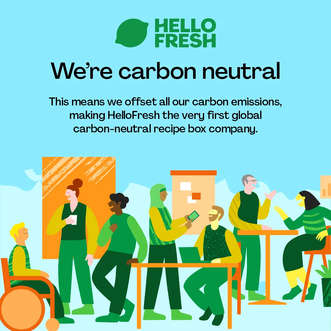
HelloFresh — Carbon Neutral Announcement Illustration — Food & Beverage Ad Example
This ad effectively communicates HelloFresh's carbon-neutral status using a split-composition layout. The upper half features bold, clear text against a bright blue background, immediately conveying the core message with strong visual hierarchy. The lower half employs a vibrant, inclusive illustration of diverse individuals in a collaborative setting, reinforcing a community-oriented, positive brand image. The dominant green and blue color palette evokes nature, freshness, and environmental responsibility, aligning perfectly with the environmental message. Text hierarchy is strong, with the headline drawing immediate attention, followed by a detailed explanation. Optimized for social feeds like Instagram or Facebook, its clean, illustrative style and positive messaging are designed to stop the scroll and build brand affinity through shared values, rather than direct conversion. The overall composition balances informative text with engaging visuals, making the complex topic of carbon neutrality accessible and appealing to a broad audience.
Why This Ad Works
Clear, bold headline grabs attention
The headline "We're carbon neutral" is large and centered, immediately communicating the key message. This directness cuts through feed clutter, ensuring the primary value proposition is understood within seconds, crucial for awareness campaigns on fast-scrolling platforms, maximizing initial impact and message retention.
Illustrative style conveys positive brand values
The diverse, friendly illustration in the lower half creates an approachable and inclusive brand image. This visual storytelling humanizes the corporate announcement, making the environmental commitment feel more relatable and authentic to a broad audience, fostering emotional connection and brand loyalty beyond just product features.
Strategic color palette reinforces eco-message
The prominent use of greens and blues throughout the ad, from the logo to the background and character attire, strongly associates HelloFresh with nature, freshness, and environmental responsibility. This consistent color psychology subtly yet powerfully reinforces the carbon-neutral claim, enhancing brand perception and message credibility.
Ad Specs
Color Palette
Original Ad Copy
How to Clone This Ad
From reference to ready-to-run ad
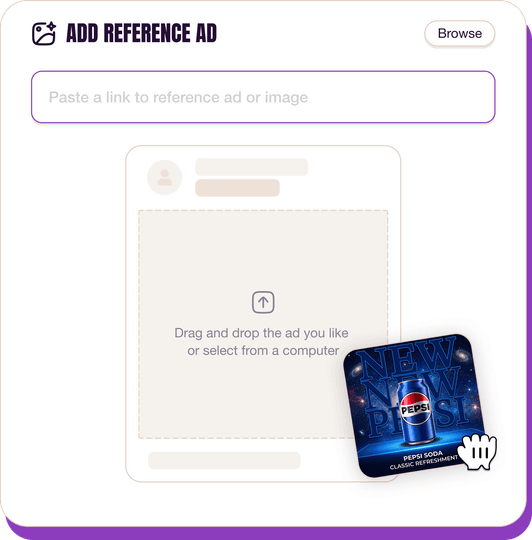
Pick a reference ad
Browse the library or upload any ad spotted in the wild.
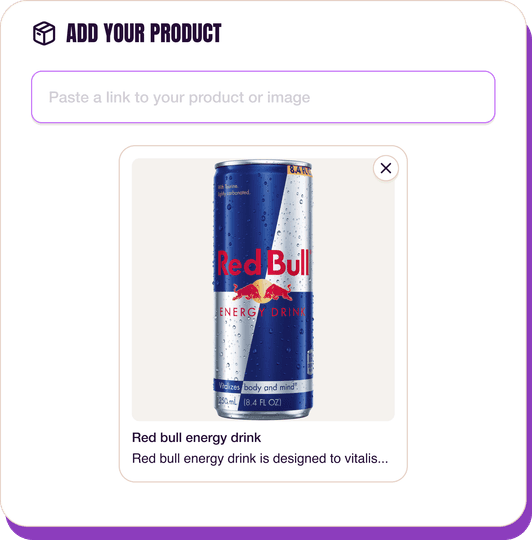
Upload a product photo
Any angle, any background. One photo is enough.
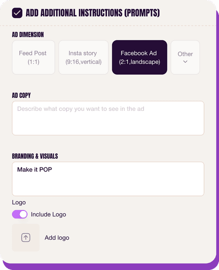
Customize the ad
Pick dimensions, add ad copy, upload your logo — AdDogs handles the rest.
Get your ad in every format, for every platform
Instagram, Facebook, TikTok, LinkedIn, Google — every ad size generated in one shot.
What You Could Improve
Add a clear call-to-action for engagement
While an awareness ad, including a soft CTA like "Learn More" or "Explore Our Mission" could drive interested users to a landing page. This would capture engagement from environmentally conscious consumers, moving them further down the funnel and providing an avenue for deeper brand interaction and information discovery.
Consider animating the illustration for dynamic platforms
For platforms like Instagram Stories or TikTok, a subtle animation of the characters or background elements could increase engagement. Dynamic visuals often outperform static images in terms of view duration and shareability, enhancing the ad's reach and impact, especially for a brand-building message like this.
Questions
AdDogs rebuilds the ad with your product photo and extracts your brand colors automatically from your logo. Same layout and composition — your product, your brand.
Pick your dimension per generation. Basic includes 3 dimensions: square (1:1) for Instagram and Facebook feeds, portrait (9:16) for Stories and Reels, landscape (16:9) for Google Display and YouTube. Pro and Ultimate unlock all 14, including Pinterest (2:3), cinematic (21:9), and banners.
Built for food & beverage products. The Text-Heavy composition works best when the product photo carries the persuasion. Any background, any angle — AdDogs handles the cutout.
One credit. $0.40 on the Basic plan ($12/mo for 30 credits), $0.33 on Pro. One credit produces one finished ad in the dimension you pick.
Disproportionately well for Gen-Z CPG. Liquid Death, Poppi, Graza, and Fly By Jing all scaled on TikTok with UGC-style creative and trend-matching. TikTok-native content looks less polished, more irreverent, and short (under 15 seconds). If your food brand skews under 35, a TikTok-first creative strategy likely beats Meta-first for the first $500k in paid spend.
Liquid Death runs the most culturally viral creative in beverage. Poppi and Olipop lead functional soda on Meta and TikTok. Graza owns the DTC olive oil category with bright-green squeeze-bottle aesthetics. Magic Spoon built cereal paid growth on retro-box nostalgia. Fly By Jing dominates Chinese-pantry spice. Each brand has a weekly creative rotation worth studying for hook patterns.
More Food & Beverage Ad Examples
View all

By Industry
By Format
Clone Your First Ad
Pick a template. Upload your product. Seconds later, you have an ad ready to launch. No design skills. No Photoshop.
Create your ad
