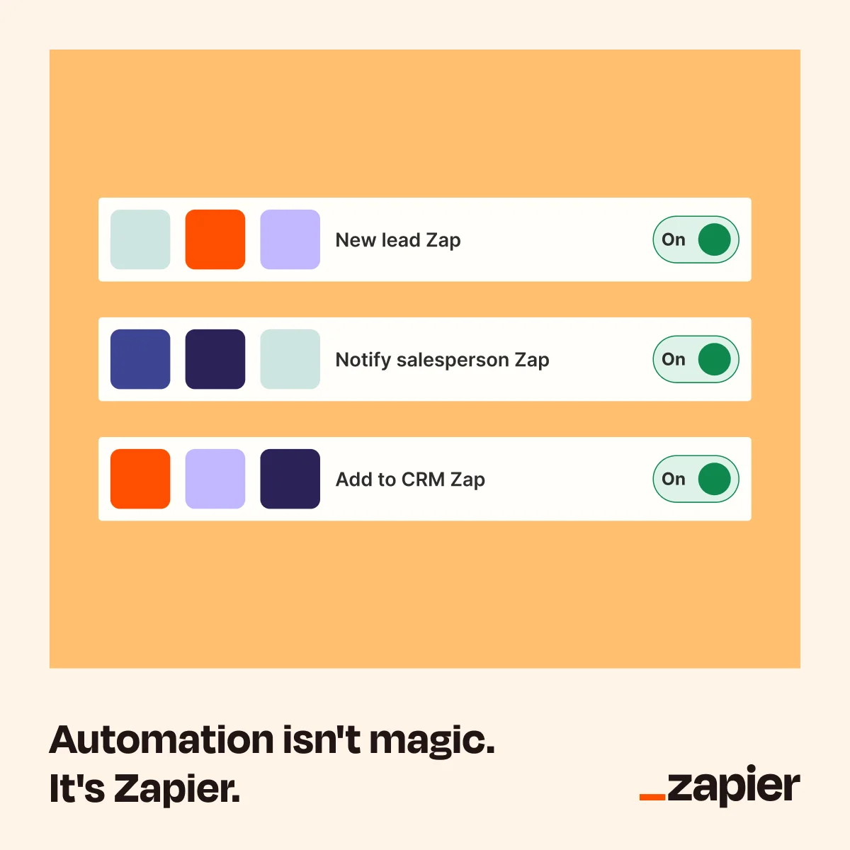
Zapier Zapier Automation UI Mockup — Clean Feature Highlight — SaaS & Tech Ad Example
This ad effectively uses a split-screen layout, dedicating the upper portion to a clean UI mockup demonstrating Zapier's core automation functionality. The warm, inviting orange background contrasts sharply with the crisp white UI elements, drawing immediate attention to the product's interface. Color psychology is leveraged with vibrant green "On" toggles, signaling active and successful automation. The composition is simple yet powerful, guiding the eye from the functional demonstration to the bold, reassuring headline at the bottom. Optimized for platforms like Facebook, its clear visual message and minimal text ensure quick comprehension on mobile feeds. The ad demystifies automation, positioning Zapier as the accessible solution, making it highly effective for driving initial awareness and consideration among small business owners.
Why This Ad Works
UI Mockup simplifies complex automation
The ad cleverly uses a familiar toggle-switch UI to illustrate complex automation workflows. This visual metaphor makes the abstract concept of "Zaps" tangible and easy to understand, immediately communicating the product's value proposition without requiring extensive explanation. It builds trust through clarity.
Contrasting colors highlight key actions
The vibrant orange background provides a strong base, while the white UI elements pop, ensuring readability. Crucially, the bright green "On" toggles draw the eye to the active state of automation, visually reinforcing the idea of seamless, working processes. This color contrast enhances message clarity.
Direct headline demystifies product
The headline "Automation isn't magic. It's Zapier." directly addresses a common perception of automation as complex or intimidating. By reframing it as a tangible, accessible solution, the ad immediately positions Zapier as a practical tool, building confidence and encouraging further engagement with the brand.
Ad Specs
Color Palette
Original Ad Copy
How to Clone This Ad
From reference to ready-to-run ad
Pick a template
Click "Use This Template" at the top of this page.

Upload your product
Any angle, any background — AdDogs handles the cutout.
Brand auto-applied
Your colors and logo pulled straight from your brand.
Pick your dimension
14 aspect ratios on Pro and Ultimate, 3 on Free and Basic. One credit per generation.
What You Could Improve
Add a specific benefit-driven sub-headline
While the current headline is strong for awareness, adding a sub-headline like "Connect your apps, automate your tasks" could provide immediate functional clarity. This would help users quickly grasp what Zapier does, increasing click-through rates for consideration campaigns.
Introduce a clear call-to-action button
The ad currently lacks an explicit CTA button within the image itself. Adding a prominent "Try Zapier Free" or "Learn More" button would guide users directly to the next step. This reduces friction and provides a clear path for interested prospects, potentially boosting conversion rates on platforms where in-image CTAs perform well.
Questions
AdDogs rebuilds the ad with your product photo and extracts your brand colors automatically from your logo. Same layout and composition — your product, your brand.
Pick your dimension per generation. Free and Basic include 3 dimensions: square (1:1) for Instagram and Facebook feeds, portrait (9:16) for Stories and Reels, landscape (16:9) for Google Display and YouTube. Pro and Ultimate unlock all 14, including Pinterest (2:3), cinematic (21:9), and banners.
Built for software & tools products. The UI Mockup composition works best when the product photo carries the persuasion. Any background, any angle — AdDogs handles the cutout.
One credit. $0.40 on the Basic plan ($12/mo for 30 credits), $0.33 on Pro. One credit produces one finished ad in the dimension you pick. Five free credits to start, no card.
Single-image Sponsored Content at 1.91:1 (1200x627) with a screenshot-led hero and a problem-led headline dominates B2B LinkedIn CTR. Single-image beats carousel for most SaaS because LinkedIn's feed rewards fast comprehension over swipe depth. Document ads (PDF carousels) work well for gated-content funnels — HubSpot built a paid engine on this format. Sponsored video runs higher on brand-awareness but rarely beats static on cost-per-lead once you're past the discovery phase.
Grammarly runs the most prolific consumer-SaaS paid creative — the red-squiggle moment is a hook adapted across hundreds of variants. HubSpot leads B2B content-gated creative with template-download offers and pipeline screenshots. Notion and Linear hold the productivity-tool aesthetic tier with tight palette discipline. Airtable owns the spreadsheet-to-database before-after. Webflow runs designer-targeted creative with site-builder screenshots. Each brand rotates creative weekly.
More SaaS & Tech Ad Examples
View all


Similar Style in Other Categories

By Industry
By Format
Clone Your First Ad
Pick a template. Upload your product. Seconds later, you have an ad ready to launch. No design skills. No Photoshop.
Create your ad