
Curology — In-Use Comparison Lifestyle — Skincare Ad Example
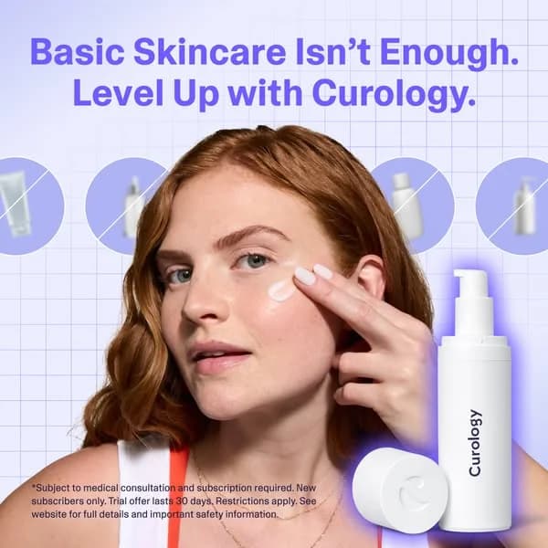
This Curology ad effectively combines a lifestyle shot with a clear value proposition. The layout features a relatable model applying the product, immediately demonstrating its in-use benefit. Compositionally, the model occupies the left-to-center, drawing the eye, while the product is prominently displayed bottom-right, glowing with a purple halo. The background's subtle grid pattern and light purple hue provide a clean, modern aesthetic without distracting from the subject. Crucially, the crossed-out generic bottles in the background visually reinforce the headline's 'Basic Skincare Isn't Enough' message, setting up a direct comparison. The bold, high-contrast headline ensures immediate readability and positions Curology as the superior solution. This design is optimized for platforms like Instagram, where authentic visuals and clear messaging drive engagement, encouraging users to consider a personalized approach over generic alternatives. The text hierarchy prioritizes the problem-solution statement, followed by the brand, making it effective for awareness and consideration.
Why This Ad Works
Direct comparison highlights product superiority
The visual cue of generic, crossed-out bottles immediately contrasts Curology with 'basic skincare.' This clever composition technique visually reinforces the headline's claim, positioning Curology as a superior, personalized solution. It helps potential customers quickly grasp the unique value proposition, driving consideration by showing what they're missing.
Authentic model in-use builds trust
Featuring a natural-looking model applying the product creates relatability and authenticity. This lifestyle approach allows viewers to envision themselves using Curology, fostering trust and demonstrating the product's ease of integration into a daily routine. It moves beyond sterile product shots, making the brand feel more approachable and effective.
Bold headline creates immediate problem/solution
The prominent, high-contrast headline "Basic Skincare Isn't Enough. Level Up with Curology." immediately identifies a common pain point and offers a clear solution. This direct approach captures attention quickly and frames the ad as a relevant answer to the viewer's skincare concerns, driving initial engagement and curiosity.
Ad Specs
Color Palette
Original Ad Copy
How to Clone This Ad
From reference to ready-to-run ad
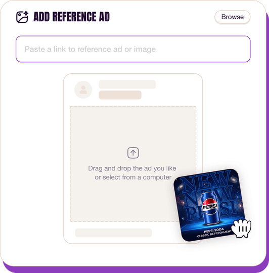
Pick a reference ad
Browse the library or upload any ad spotted in the wild.
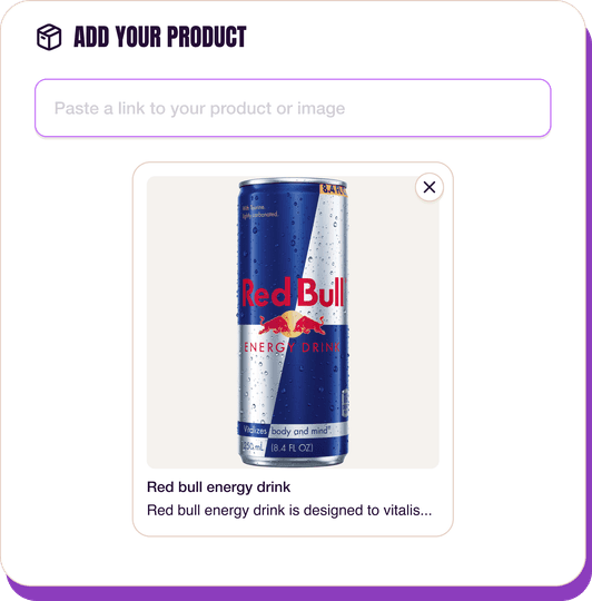
Upload a product photo
Any angle, any background. One photo is enough.
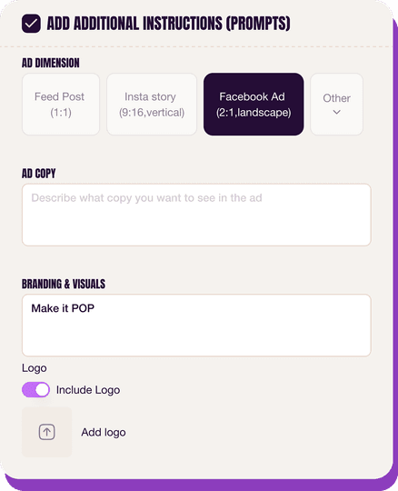
Customize the ad
Pick dimensions, add ad copy, upload your logo — AdDogs handles the rest.
Get your ad in every format, for every platform
Instagram, Facebook, TikTok, LinkedIn, Google — every ad size generated in one shot.
What You Could Improve
Add a clear call-to-action button
The ad lacks an explicit call-to-action button or text within the image. While platform CTAs are present, including a prominent "Learn More" or "Get Started" button directly on the creative could significantly boost click-through rates. This guides user action more directly, reducing friction and improving conversion funnel efficiency.
Simplify background for cleaner focus
The background's grid pattern, while modern, adds a slight visual distraction. Simplifying the backdrop to a solid color or a very subtle gradient could enhance focus on the model and product. A cleaner aesthetic would allow the key elements to pop more effectively, improving overall visual hierarchy and ensuring maximum impact.
Questions
AdDogs rebuilds the ad with your product photo and extracts your brand colors automatically from your logo. Same layout and composition — your product, your brand.
Pick your dimension per generation. Basic includes 3 dimensions: square (1:1) for Instagram and Facebook feeds, portrait (9:16) for Stories and Reels, landscape (16:9) for Google Display and YouTube. Pro and Ultimate unlock all 14, including Pinterest (2:3), cinematic (21:9), and banners.
Built for health & wellness products. The In-Use/Action composition works best when the product photo carries the persuasion. Any background, any angle — AdDogs handles the cutout.
One credit. $0.40 on the Basic plan ($12/mo for 30 credits), $0.33 on Pro. One credit produces one finished ad in the dimension you pick.
Split-screen before-afters still top every CTR benchmark for skincare, followed by close-up texture pours (serum drops, cream swatches) and carousel routines that walk through an AM or PM lineup. Static hero shots on white are the weakest format — they read as stock catalog. Reels-native vertical video with a single-hand application shot has overtaken static carousel in Gen-Z audiences over the last 18 months.
Instagram Reels and Stories are non-negotiable — that's where skincare shoppers live. TikTok next for anyone targeting under 30, where dermfluencer-style UGC dominates. Pinterest converts well on routine and ingredient-research content. Hold off on YouTube pre-roll and Meta search until you've validated creative on Reels. A cold Reels campaign with $500 spend tells you more about product-market fit than a month of Pinterest.
More Skincare Ad Examples
View all

By Industry
By Format
Clone Your First Ad
Pick a template. Upload your product. Seconds later, you have an ad ready to launch. No design skills. No Photoshop.
Create your ad
