
G FUEL vs. Generic — Split Comparison Ad — Food & Beverage Ad Example
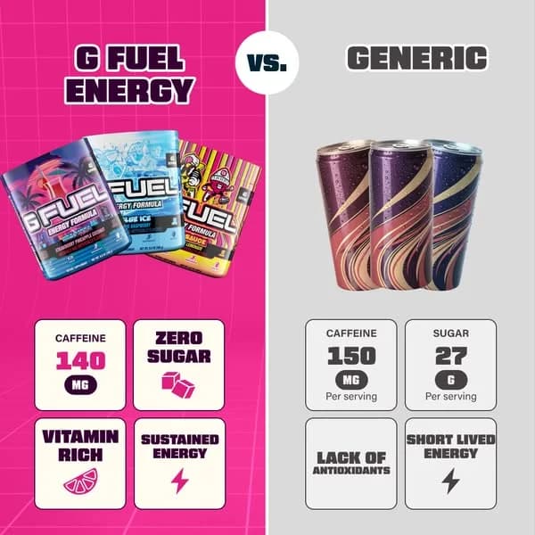
This ad employs a stark split-screen comparison layout, leveraging a vibrant pink for G FUEL against a muted grey for "Generic" to immediately differentiate and highlight the brand. The composition strategically places G FUEL's product imagery and benefits on the left, aligning with natural reading patterns, while contrasting it with a generic competitor on the right. Color psychology uses the energetic pink to associate G FUEL with vitality and excitement, contrasting the dullness of the generic option. Text hierarchy is clear, with bold headlines establishing the comparison, followed by a grid of key features and drawbacks. This direct approach is optimized for platforms like Facebook or Instagram, where quick, digestible information and strong visual contrast are crucial for stopping the scroll and driving consideration. The ad effectively uses a "vs." narrative to position G FUEL as the superior choice, appealing to consumers seeking specific benefits like zero sugar and sustained energy.
Why This Ad Works
Direct Comparison Layout Drives Clarity
The split-screen "VS." format immediately communicates the ad's purpose: to highlight G FUEL's superiority. This direct comparison simplifies the decision-making process for the viewer, making the benefits of G FUEL clear and actionable against a perceived alternative, which is crucial for quick ad comprehension.
Vibrant Color Psychology for Brand Association
The use of a bold, energetic pink for the G FUEL side instantly grabs attention and aligns with the brand's youthful, high-energy persona. This vibrant palette creates a strong emotional connection, making G FUEL appear more appealing and dynamic compared to the dull, neutral grey of the generic side, enhancing brand recall.
Clear Feature-Benefit Grid for Quick Consumption
The structured grid of four key points on each side allows for rapid scanning and understanding of complex information. By presenting benefits like "ZERO SUGAR" and "SUSTAINED ENERGY" alongside the generic's drawbacks, the ad efficiently educates the audience on G FUEL's value proposition, driving consideration effectively.
Ad Specs
Color Palette
Original Ad Copy
How to Clone This Ad
From reference to ready-to-run ad
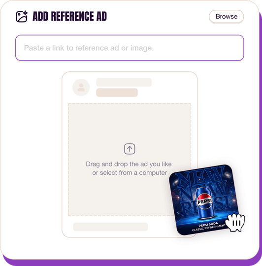
Pick a reference ad
Browse the library or upload any ad spotted in the wild.
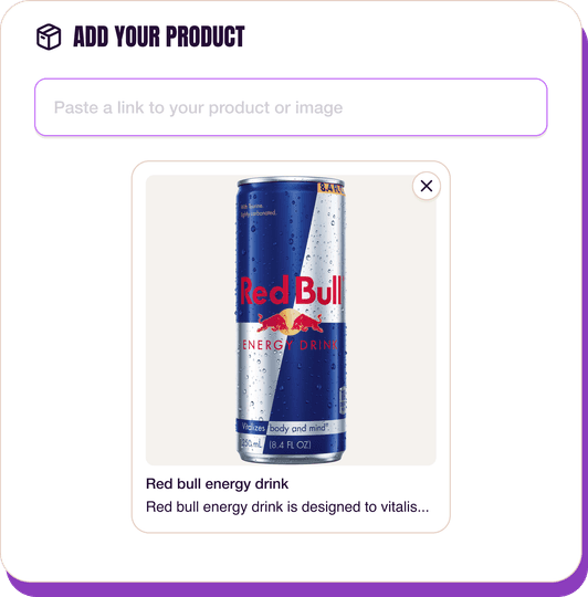
Upload a product photo
Any angle, any background. One photo is enough.
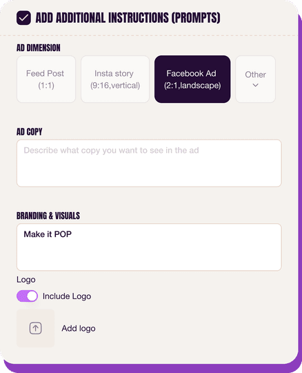
Customize the ad
Pick dimensions, add ad copy, upload your logo — AdDogs handles the rest.
Get your ad in every format, for every platform
Instagram, Facebook, TikTok, LinkedIn, Google — every ad size generated in one shot.
What You Could Improve
Add a specific Call-to-Action (CTA)
The ad lacks a clear CTA button or text. Adding "Shop Now," "Learn More," or "Discover Flavors" would guide interested viewers to the next step, significantly improving conversion rates by reducing friction and providing a clear path for engagement and purchase intent.
Introduce a limited-time offer or discount
While the ad highlights benefits, a lack of immediate incentive might delay purchase. Testing a small introductory discount or a bundle offer, clearly displayed, could create urgency and motivate first-time buyers, especially for a product in a competitive market, boosting conversion performance.
Questions
AdDogs rebuilds the ad with your product photo and extracts your brand colors automatically from your logo. Same layout and composition — your product, your brand.
Pick your dimension per generation. Basic includes 3 dimensions: square (1:1) for Instagram and Facebook feeds, portrait (9:16) for Stories and Reels, landscape (16:9) for Google Display and YouTube. Pro and Ultimate unlock all 14, including Pinterest (2:3), cinematic (21:9), and banners.
Built for health & wellness and food & beverage products. The Comparison composition works best when the product photo carries the persuasion. Any background, any angle — AdDogs handles the cutout.
One credit. $0.40 on the Basic plan ($12/mo for 30 credits), $0.33 on Pro. One credit produces one finished ad in the dimension you pick.
Disproportionately well for Gen-Z CPG. Liquid Death, Poppi, Graza, and Fly By Jing all scaled on TikTok with UGC-style creative and trend-matching. TikTok-native content looks less polished, more irreverent, and short (under 15 seconds). If your food brand skews under 35, a TikTok-first creative strategy likely beats Meta-first for the first $500k in paid spend.
Liquid Death runs the most culturally viral creative in beverage. Poppi and Olipop lead functional soda on Meta and TikTok. Graza owns the DTC olive oil category with bright-green squeeze-bottle aesthetics. Magic Spoon built cereal paid growth on retro-box nostalgia. Fly By Jing dominates Chinese-pantry spice. Each brand has a weekly creative rotation worth studying for hook patterns.
More Food & Beverage Ad Examples
View all


By Industry
By Format
Clone Your First Ad
Pick a template. Upload your product. Seconds later, you have an ad ready to launch. No design skills. No Photoshop.
Create your ad
